Monday, December 31, 2007

New art from Lindsay Palmer

It is always such a treat to be able to work with new artists and get to be a part of local art scene. Lindsay Palmer is an artist, curator and writer living in Tempe, Arizona. Currently, she is the curator of the Shemer Art Center and Museum. She has a show of her photography coming up the first week of January that will run until the end of the month. Start the new year off right and support local artists!

Lindsay Palmer presents a series of large-scale, color photographs in a solo exhibition, Through a Glass... at eye lounge: a contemporary art space, artist-run gallery in downtown Phoenix. Palmer’s work examines the nature of photography, challenging the medium’s perceived ability to represent reality. Her latest body of work juxtaposes objects from popular culture against an idealized portrait of nature, suggesting a collision between material culture and the environment. In the words of the artist “I expose the landscape for what I see it fast becoming: a backdrop for our metropolis”. The exhibition, “Through a Glass...” questions the ethical responsibility of aesthetic appeal.

Monday, December 24, 2007

Happy holidays!


All of us at Mighty Imaging would like to extend warm wishes this holiday season. We hope your home is filled with love and joy. May you be blessed with health and happiness in the year to come.

Thursday, December 13, 2007

Photo Miami 2007


Last week the Wynwood Art District in Miami hosted photo MIAMI. An international contemporary art fair that features photo-based, video, and new media art. The event takes place in conjunction with the Art Basel Miami Beach art fair. Although I was unable to make it across country to check out the event, it looks like there was some amazing new work shown. James Danziger did travel to the show, and have many pictures of the work on his blog; The Year in Pictures. Looks like many of the artists chose to create big prints to show their work. That is what we like to see.

photo MIAMI, the only fair during Art Basel Miami Beach dedicated exclusively to contemporary photography and media based art, offers an expansive and immediate overview of these current international trends. It showcases a range of established to emerging galleries, presents curated sections by global artists and curators, and partners with local and international art institutions. This year the fair will host an even greater number of selected exhibitors from 11 countries.

Friday, December 07, 2007

Painted glass photo mat

This is a great way to add a personal touch to your artwork for yourself, or as a gift. You can use items that you may already have laying around the house. Nothing too out of the ordinary that a quick trip to an art supply store couldn't take care of. Instructables is a great site full of these kinds of useful ideas. You may need to sign up as a member to see all the steps.

Painted Glass Photo Mat

Create a great looking Photo Mat, without cutting Mat Board, or requiring any special tools.

Materials Needed
Here's the list of materials needed for this Instructable:

- A Photo to Frame (any size you wish)
- Picture Frame (with glass, precut photo mat not required)
--- NOTE: The picture frame MUST be at least 2-3 inches larger in all directions than the photo you are planning to put into this frame. The extra area will provide the space for you to paint, while still allowing your photo to be fully viewed.
- Acrylic Paint (buy individual paint tubes, or a set of many colors)
- Paint Brushes for Acrylic Paints (in whatever sizes/design you prefer)
- Poster board (or large piece of cardboard)

Misc items from around the house:

- Ruler
- Pen/Pencil
- Double-sided tape
- Scissors

Wednesday, December 05, 2007

Use photos to make a holiday gift

We are in the midst of the holiday shopping season. If you are like me, you still have people on your list that you are desperately trying to think of something unique and creative to get "the person who has everything". A photo gift could be the perfect solution.

There are many ways you can make your gift unique.
  • You can do a large print of a particularly memorable day and have it framed.
  • If your camera does not take images big enough to do one large photograph, how about making a collage in Photoshop of special memories and turning it in to one big print?
  • Get a print made of your child's drawing for the grandparents. Printing it on canvas will make it look even more like a masterpiece.
  • Find an old photo of an ancestor, we can restore it, and then make prints for all of your family members.
  • You can also purchase a fine art print of one of their favorite locations or a theme that will fit their decor.

You get the idea. There are many ways to make your photo gift personal and memorable. There is still time to order and get it by Christmas. Anything you choose to do will be a one of a kind gift that they will cherish for years to come.

Friday, November 30, 2007

Better color for your photos on the web

This is another reason to love Mozilla's web browser, Firefox. Their latest incarnation Firefox 3.0, which is now still in beta and will launch next year, has an exciting color profiling feature as one of their upgrades. The new version will read the color profile saved in your images and then take in to consideration the characteristics and settings of the monitor it is being viewed on to give a more accurate appearance. This is good news for many photographers out there.

Firefox 3 to enable better color online

The look of images differs between managed and unmanaged applications (screenshot of the same image in Safari vs. Firefox 2), so FF getting on board with color management is great news for designers & photographers who value consistency. For more background on why this is an important advance for the Web, see my notes on the color-managed Safari coming to Windows.

Wednesday, November 21, 2007

James Cowlin featured in PhotoMedia

If you have never had the opportunity to pick up PhotoMedia magazine, you are missing out on a great photo publication. It comes out four times a year, and consistently prints compelling stories and photography. In their Fall 2007 issue they featured a large spread on James Cowlin and his favorite project, the Historic U.S. Route 89 Society. James wrote and provided the images for the article highlighting the beauty of this unique stretch of highway. If you are up for a road trip, Jim offers 7 different destinations to visit from the Southern border of Arizona and Mexico up through to Southern Utah, along with shooting tips for each location. James has also just launched a new design of his website. Of course, you can also purchase Jim's images through his gallery. Congrats to Jim on all his success!

Border to Border
A photographic journey north on U.S. Route 89, the West’s most ‘Western’ highway.

Here’s are some other facts I discovered about U.S. Route 89:
• The highway traverses all of the geographic provinces of the interior American West, from the Basin and Range to the Colorado Plateau, across the Rocky Mountains and into the Great Plains.
• In addition to the national parks, there are 13 national monuments, one national recreation area, 14 national forests, 22 national wilderness areas, and 20 state parks and historic sites on or near the road.
• Highway 89 passes through three major metropolitan areas: Tucson, Phoenix and Salt Lake City. It also passes through numerous small towns, where travelers can still get a taste of the Old West.

Just driving along this road, you can learn much about the people and cultures that populated the West — from the Ancestral Puebloans and other native peoples on through the Spanish conquistadors, the westward expansion of the United States, the Mormon settlement and the growth of modern cities.

Route 89 provides access to some of the most iconic Western landscapes, but alert travelers can also find some lesser-known gems where landscape and travel photographers can practice their craft. Here are a few starting points for the southern portion of your explorations.

Monday, November 19, 2007

The importance of a portfolio

Tom Miles of Photosmudger has a great post on the importance of always having a good portfolio of your work ready and on hand. Printing some of your images on Kodak Metallic or FujiFlex could make a lasting impression as well. Thanks to Don for the find!

Portfolios - What and Why

Even in this high-tech, information superhighway, digitised, sci-fi, skinny latte, post-modern, post-impressionist, post-everything world there's still a very important place within photography for the distinctly old-school portfolio. There's very little here that will be news to experienced photographers, as without making good use of their portfolio they're unlikely to have lasted long in the commercial world. However for people just starting out, or those whose only real experience of showing their work off is is via flickr and other websites, read on.

Why?

The most important aspect of a physical portfolio lies not so much in the pictures themselves as in the fact that to view it an Art Director will pretty much always have to meet you in person, and this can have as much influence as the work itself. I will go into this aspect in greater depth in a later post, but for now it's sufficient to say that in many areas of commercial photography (advertising/editorial/fashion and so on) your personality can be as important as your work, and you should never miss an opportunity to meet clients face to face and have a good natter.

Friday, November 16, 2007

Holiday digital camera buying guide

The holiday shopping season is upon us. A new digital camera is on many people's wish list. If you are thinking of buying a new camera for yourself or a photo fanatic in your family and are not sure where to start Yahoo! has posted a shopping guide by David Elrich of DigitalTrends that can help. The most sensible advise is to be purchase a camera that most fits your needs. If you plan on making big prints make sure you buy a camera that is 8 megapixels or larger.

Digital Cameras: Buying Made Simple

You've decided to buy a digital camera - or upgrade to a newer, more powerful one. You're not alone.

According to industry experts, close to 30 million digital cameras will be bought this year. And these hefty figures don't include the millions of camera-phone owners who take zillions of snapshots every day.

When you're researching different cameras, manufacturers will state the maximum file (or picture) size you can take. In the case of a 6 megapixel camera, it's 2816 horizontal pixels x 2112 vertical pixels, with 7MP it's 3072 x 2304 and so on. Simply multiply the numbers and you get the effective resolution of the imaging device. We suggest you avoid anything less than 6 or 7MP at this point unless you're looking for an inexpensive camera for the kids.

Pros have access to 21-megapixel imagers in very expensive D-SLRs. You don't have to go this route or spend that much money for great everyday photos, but 6MP should be your minimum. If you plan on making very large prints, such as 13x19s, or you think you might experiment with imaging software, consider 8 or more megapixels. There are no hard-and-fast rules, since so much depends on your final end use.

Wednesday, November 14, 2007

Creating your own gigapixel image

Photopreneur is a blog that offers ideas, inspiration, and opportunities for photographers on how to market themselves and inventive ways to generate revenue from their photography. If you have never visited them before, you should check it out. You will be dizzy with ideas and might have several "Why didn't I think of that?" moments after an hour of reading. It is a great resource for photographers.

They had a feature on photographer Max Lyons. He specializes in gigapixel photography. He shot his first gigapixel image in 2003 of Bryce Canyon. Technology has helped speed up the once daunting task of merging the many shots taken to comprise the gigapixel image, he developed a software program called PTAssembler. The post has several tips if you are considering trying to create a gigapixel image of your own.

"The software I’ve created to produce these images (originally written in 2003) has no size constraint. From a purely technical standpoint, it would be a trivial matter to produce images of two, 20 or 200 gigapixels."
Of course, it’s not quite that easy. Max points out that while his program has now cut the time to assemble a one gigapixel mosaic from several weeks to just two hours, most of which is automated, capturing each photo “tile” with a long focal-length lens can take “a considerable amount of time.” It took Max seventeen minutes with a six megapixel Canon D60 to shoot the 196 separate images that went into the Bryce Canyon panorama. That in turn creates problems with movement, changing light and depth of field, and can limit the range of subjects that can be shot using this method:
"In fact, if you look at the works of other high resolution photographers, you’ll see that most really large images (gigapixel and beyond) tend to be either (a) of interior, flat surfaces where depth of field, motion and lighting changes are not such problems, (b) scenes that look OK when viewed at tiny size, but have such a narrow depth of field that most of the image is hopelessly blurry when viewed at full size and/or (c) suffer from obvious misalignments and obvious lighting changes…"

What also impressed me about Max's work is his choice for printing his gigapixel files. He uses a LightJet to print his highly detailed images. It is a perfect illustration of the power of the machine. You can read the title off of the books in this shot of the Library of Congress Reading Room. You can't do that with an inkjet.

Monday, November 12, 2007

Turn your image in to vector art for free


VectorMagic, developed by Stanford University Artificial Intelligence Laboratory, is a free online service that will allow you to take any image and turn it in to vector art. If you have ever had to work with placing a logo that was way too small for your layout, this could be a lifesaver. Once you have your new vector image you can download it as an EPS and manipulate it as needed. Since it is now vector art, you can make it as big as you need to for your design or big enough to cover an entire wall. It can be used for photo, but you will loose detail. It takes on an animated kind of pop art type look. We have printed files prepared in a similar style on Metallic paper that looked incredible.

What is vectorization?

Vectorization (aka tracing) is the process of converting a raster image to a vector image.

Raster images are pixel-based, whereas vector image are represented by geometric shapes such as lines, circles and curves.

Wednesday, November 07, 2007

Deck the halls

Now that Halloween has past, the holiday retail push is on. Any store you walk past or frequent has their own display to promote their holiday merchandise. Trio Display has some great ideas on how to keep your seasonal display creative, fresh, and (most importantly) drive sales. Large graphics of winter scenes or abstracts of holiday themes (like this close up image of a Christmas ornament) can add some visual interest to the shopping experience. It is also another chance for you to promote your company's brand.

The Retailer's Guide to Holiday Themes:

How can you carve a niche for yourself this holiday season? You don’t have to spend big bucks to draw people into your store. But don’t be a Scrooge, either. You should be on the lookout year-round for holiday-season design elements.

Changing out your windows displays regularly conveys to shoppers that yours is a store that keeps up with the times.

If you don’t feel artistic enough to tackle such projects, consider students or recent grads of local design schools. They’re usually eager to add to their portfolio, so have them come up with a holiday concept for your store. If you like it, reward them with merchandise, cash or an internship.

Remember to check out the windows and interiors of stores that are know for great holiday themes. Eddie Bauer, Target and Restoration Hardware are chains that come to mind. But each city and town has its own cadre of retail stores that are known for their imaginative themes. Pay them a visit to get some free lessons.

Monday, November 05, 2007

No more naked walls!

Naked? Bueno! Naked walls? No bueno!

As you know we here at Mighty Imaging love BIG PRINTS. We love making photographs in to really large (huge) prints of astounding sharpness and clarity. With that in mind, we set about the mission of dressing up one of our favorite customers.
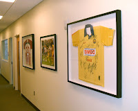
Global Spectrum; a leader in sports, entertainment, and facility management, is in charge of operations for the award winning state of the art University of Phoenix stadium. Like many things in the Vally of the Sun, the stadium is brand spanking new. That means that Global's offices were nothing but naked walls. The first thing that we thought of was what a great place for large images. Just imagine how cool a bunch of big prints custom framed would look. Since everybody from the Arizona Cardinals of the NFL to the Rolling Stones have played there, how about tying it in to a theme of the company and the events that take place? Talk about inspiring interest!
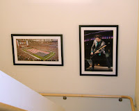
Making a great first impression is always a good idea, and these exciting and vibrant event images make the office look fun and creative. Not only do our prints tell the Global Spectrum story to their customers, but it also creates a strong statement and fun work environment for their own people as well.

If your company's walls need to get dressed up here are a few ideas. First pick a theme, whatever you think will make the statement that you want. Not only will this unify the look of the images on the walls, but it will also unify the workplace. You could hire a photographer and have them find quirky abstract shots around the company plant or office. Then make huge prints that would attract attention by being familiar, yet not so easily recognized. Another idea is to collect a group of snapshots from the company picnic or holiday party and make a collage out of them. Your 30x40 lobby print can show that your company is proud of its employees and that you are a close team of workers.

Either way, the walls of your business should never be bare, so let's dare to dress them up!

Thursday, November 01, 2007

A good time was had by all

Dennis Scully put together these time lapse videos of the two opening nights of the Through Each Other's Eyes Mexican Exchange Exhibition at the Historic Southwest Cotton Company last month. What a terrific venue for the artwork. There was great art, music, and food. Truly a good time was had by all. Our thanks to Dennis for the fun recap of the event.

To read more about Mighty's involvement with TEOE see our earlier post.

First Friday


Saturday Artist's Reception

Monday, October 29, 2007

'Cleanliness is next to fastiness'

Scott Byer and Adam Jerugim of Adobe gave a lecture at Photoshop World this past September about optimizing your computer's performance when working with big files. Scott has posted the lecture notes on his blog Living Photoshop. There are guides for Mac and PC settings you can change and ways to test your system's speed. Most of our customers will spend hours of their day working with large files for big prints. This comprehensive guide could help you shave off some time in your work flow. Couldn't we all use some extra minutes in the day?

Photoshop World - Heavy Lifting:

I wanted to call out a couple of things that are currently buried in the speaker notes, and I'm not sure if I got them across appropriately. First, setting Photoshop's memory percentage to 100% only makes sense if you've got more than 4GB of RAM in the machine, and again, only if you haven't run into trouble running the filters you need that way, and are on CS3. We've improved our ability to back off in the case that the machine we're on starts to page every version. However, it's still important to watch that free RAM (or, in the case of Vista, the amount still being used for the system file cache). It's important that you watch what's going on on your system when pushing things to their limit. If you're regularly seeing free memory (or the amount of free memory + system cache on vista) go below 20MB, it's time to back off that memory percentage setting and try again.

Thursday, October 25, 2007

Christine Taft gets the blue ribbon

Christine Taft was awarded 1st and 2nd place in the Arizona State Fair photography competition. They receive submissions from all over the state and limit entries to 4 photographs per category. For Christine to place 2 out of the 4 pictures she submitted, and beat out all the hundreds of other submissions, is a big accomplishment. She was awarded 1st place for her Calm of Fall image and 2nd place for Awakening to the Light. Congrats Christine!

You can go see Christine's prints at the Arizona State Fair Grounds at the Coliseum North Hall through November 4th (closed Mondays).

Tuesday, October 23, 2007

PMA 2008

You may not need much coaxing to go to Las Vegas, but if you are debating whether or not to make the trip in 2008 for the PMA (Photo Marketing Association) trade show this could help you make your decision. They have released their initial list of exhibitors and booth locations. There will be over 600 exhibitors attending. If you have any energy left after you are done, you might have time to hit the casinos. The 2008 PMA trade show will run from Jan 31 - Feb 2, 2008.

PMA '08 Exhibitor List Released: Digital Photography Review

The leading international conference and trade show, PMA 08 hosts retail entrepreneurial memory makers from around the world, including photo retailers, professional photographers, mass merchandisers, professional labs, custom picture framers, and scrapbook retailers. The PMA 08 International Convention features approximately 200 sessions, encouraging the discovery of more opportunities, professional development, and the inspiration to act on emerging trends. Further opportunities are found at the PMA 08 Trade Show, offering more picture-related products than any other event. PMA® members help people everywhere create, keep, display and share memories through pictures.

Friday, October 19, 2007

Bird on a Wire


Part of what makes what we do so fun is being able to work with such talented artists. We recently had the honor of meeting and working with Patrick Rummans for his latest art show. Patrick is a interesting fellow who has traveled the world and is now spending his time here in Arizona. He is originally from Montana and his latest show of avian photography will take him back to his home state. Although I did see the prints here before he sent them off for the show, and I know they look fantastic, I do wish I could be there for the opening. Good luck to you, Patrick! Thank you for letting us be a part of your artistic process.

All of the images from the show are also available for purchase on Patrick's gallery.

The show Bird on a Wire will be at the Lewistown Art Center in Lewistown, MT. From October 30th - November 30th. There will be an opening reception on November 4th.
I have always known that birds would be my passion in life. Even now, just holding a pigeon in my hands and breathing in the musky smell of its feathers takes me back to my childhood and the days when my relationship with birds was indelibly dyed into the fabric of who I would always be. I am completely and utterly smitten, and can never get my fill of them.

Thursday, October 11, 2007

Rick D'Elia's Uganda Photo Exhibition

We recently worked with Rick D'Elia on some images for his upcoming show at the Zuva Gallery. The Zuva Gallery is dedicating their space to help bring community awareness to the recent events in Africa. They will have an ongoing series entitled "AFRICA: AS IT IS". Their first show will focus on Uganda.
On Thursday, Octover 18, 2007 at 7:00 pm, Zuva Gallery is opening an exhibition of 40 photographs from northern Uganda titled "The Human Tragedy of Northern Uganda". The photographs are on loan from the U.S. State Department and were commissioned by the U.S. Embassy in Kampala, Uganda. The exhibit will be on display in the Zuva Gallery Special Exhibition Space at el Pedregal Shops at The Boulders Resort (Upper Level, Suite L2/L4). The exhibit continues through October 31.

The evening reception will begin with a brief talk and slide show by photojournalist Rick D'Elia. D'Elia shot many of the images in the exhibition and has traveled to Uganda multiple times. In 2003 and 2004, D'Elia spent a year working in Uganda with The Monitor, the national independent daily newspaper. During that time he also worked with development organizations in Uganda to document the projects in health and education. D'Elia has earned a number of awards in Arizona photojournalism competitions as well as top placing in National competitions. Rick D'Elia's talk will be held in the Tohono Center (Upper Level) at el Pedregal Shops at The Boulders Resort.

Tuesday, October 09, 2007

Maximize your in-store marketing efforts


Getting the customer to your store is one thing. Keeping their interest once they are there is another challenge. Using large graphics to express your marketing goal, whether it is to promote a sale or a new product you are introducing, can utilize your space to maximize your selling potential as well as help build your business brand. I found this article on Allbusiness.com, a site that offers a multitude of articles and videos that inform and inspire you to build a more successful business.

Maximize Your In-Store Marketing Efforts

While advertising can bring customers to a store, it can also work from within your store. Today many retailers realize how important in-store advertising can be to their bottom line.

Despite the drop among television viewers between 18-34, television advertising is still a 50+ billion dollar industry. Meanwhile, in-store advertising accounts for just over 15 billion dollars. This does not mean that retailers prefer advertising on television by a 3 to 1 ratio: It means that you can spend a lot less money advertising in your store. Moreover, you'll find that it can be highly effective.

...Of course, in-store advertising is most effective with a strategy. This means to first determine where to place racks, cubes, platforms, mannequins, and especially your well-designed signage in order to best display your merchandise. High-traffic areas -- doorways, cash registers, fitting rooms, for example -- should be your first consideration.

Other considerations when planning your in-store advertising include:
  • Creativity. Position your products in an interesting manner or on an original backdrop. Remember: You want to catch the eye of your customers as they pass your displays.
  • Lighting. Make sure all areas where advertising is present -- whether it's as a display or as signage -- are well lit and attractive.
  • Hands-on activities. Toy stores have displays where kids can play. Supermarkets have in-store samples. Tech stores let you test much of the merchandise. What can you do to tempt your customers?
  • Themes. Is it back-to-school time? Mothers' day? Thematic in-store advertising can focus around a specific season, holiday, or even a new trend or fashion.
  • Store layout. If your toys are in the back of the store, batteries should be as well. If women's clothing is located on the lower level, fashion accessories should be advertised and displayed en route to and from those escalators. Consider the layout of your location and how your customers get to the goodies that they seek. Then, advertise along the routes that they have to take, just as you see ads for hotels and restaurants along interstate highways.

Friday, October 05, 2007

Peter Lik photography


Peter Lik is a world renowned photographer who has over 9 galleries across the globe. I recently took a trip to Las Vegas, where he has 3 gallery locations. What is so striking about his work, besides his obvious talent, is the way that the images are presented. What may be hard to tell from the shots above are that many of his large panoramic images are printed on trans material and then traditionally matted and framed. The gallery has subdued lighting and the images glow bringing all the color and detail to life. You can't help but be drawn in to look at them. It was refreshing to see an artist use trans printing for their work and present them as finished framed pieces, so that you could imagine them fitting it to any decor or setting. It takes the art to another level. If you are ever in one of the cities where he has one of his many galleries you should make time to see it for yourself.

As a completely self-taught artist, master photographer Peter Lik started in Australia and soon expanded his vision worldwide. Huge panoramic photographs of landscapes showcase the brilliant colors and elegant, spiritual terrain in Nature. These images speak for themselves and leave the casual viewer breathless. The truly conscientious observer will experience fine art. When you come to Peter Lik Galleries, you will be able to experience a kind of natural lifestyle, accented with exotic high-end furniture and sculptures.

Friday, September 28, 2007

Through Each Other's Eyes


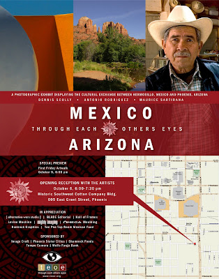
Through Each Other's Eyes is an organization 'whose goal is to promote international understanding via the medium of photography'. Among their many projects, they will select photographers from the US and do a cultural exchange with photographers from a foreign land. In their latest project two local photographers, Dennis Scully and Maurice Sartirana, travelled to Hermosillo, Mexico. Antonio Rodriquez from Mexico came to Arizona to explore. They all had the opportunity to capture some incredible images. We were honored to be able to print them for their upcoming exhibit opening October 5th at 6 PM. There will also be a reception with the artists on October 6th from 6 to 7 PM. The initial viewing will be at the Historic Southwest Cotton Company in downtown Phoenix. The show will then be moved to the Wells Fargo Central branch for another two weeks.

Wednesday, September 26, 2007

Harlem Gigapixel Image


Artist Geard Maynard in collaboration with Kolor Company created an enormous file taken from the rooftop at 7th Ave & 110th St in New York City. Gerard provided the images and Kolor provided the seaming software, Autopano Pro. The resulting 13 Gigapixel image is a combination of 2,045 12 megapixel shots that took 46 hours to render. They had to set up a special hardware for the rendering, a dual xeon quad-core processor with 8 GB memory and 2 high-speed 150 GB hard drives to make it happen. Gerard also has other composites on his website he has created that he prints with a LightJet.

Friday, September 21, 2007

Painting with light

DIYPhotography.com has a great post on using long exposure photography to "paint" a design with light in your image. The article gives details on all you will need to create this effect and different subject ideas for your project (product like shot, location shot, and environmental graffiti). A shot done with this technique would look fantastic on FujiFlex or Metallic paper. It would really bring the light to life.

Painting with light is a fun technique that gives great results. It is called painting with light because this is what you are actually doing while taking the shot - painting with light.

Here are some great ideas to use this technique with:

Product like shot - In a closed (dark) room place your product on a table and paint it's contour. You can use several colors to make a strong effect or to draw different (even imaginary) parts of your object.

Location shot - find a location with some ambient light. Find an object that is less "hit" by that light. now you can use the ambient light to capture the background, while painting the object with light. You will get a nice effect - with some surreal foreground and a "normal" background. Also the white balance will be different on ambient and painted - another cool side affect.

Environmental Graffiti - If you are shooting a wall (or even on thin air...), you can scribe on the wall. Make funny graffiti; Write huge love notes; Make a political statement - there will be no trace left other then the one on your memory card.

Thursday, September 20, 2007

The Met makes room for big prints

The largest art museum in the western hemisphere, the Metropolitan Museum of Art, (encompassing four blocks and and totaling 2 million square feet) has found some extra space to open a photography gallery. Their inaugural installation entitled Depth of Field will showcases large scale photographs that has been part of the museum's collection for several years, but did not have a proper place to display them. The show will run from September 25th through March 23rd of 2008.

New Gallery for Modern and Contemporary Photography to be Inaugurated at Metropolitan Museum in September

The Metropolitan Museum will inaugurate the Joyce and Robert Menschel Hall for Modern Photography on September 25, 2007, establishing for the first time a gallery dedicated exclusively to photography created since 1960. With high ceilings, clean detailing, and approximately 2,000 square feet of exhibition space, the Menschel Hall is designed specifically to accommodate the large-scale photographs that are an increasingly important part of contemporary art and the Museum's permanent collection. Photographers represented in the collection include such modern masters as Thomas Struth, Andreas Gursky, Thomas Ruff, Jeff Wall, Richard Prince, Cindy Sherman, Doug Aitken, and Sigmar Polke.

...During the last seven years, we have built up a following—especially among artists—with our rotating installations outside the modern art wing, but many photographs are simply too large to fit there. Now we can really show what we have been collecting," concluded Mr. Eklund.

Tuesday, September 18, 2007

Art + Faucetry = Accessible Sculpture


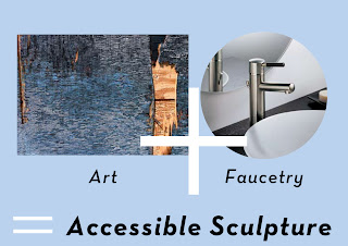
This has to be one of the most creative pairings of function and fine art I have seen. Desiree Edkins has teamed up with The Studio at Central Arizona Supply to feature her photography with their Brizo faucets. There is an opening reception September 20th at 6 PM. It is wonderful to see the parallel inspiration of photography and design showcased in such a unique way.

Accessible Sculpture:

From the people who brought the world; The Faucet Fashion Show comes Accessible Sculpture, a look at faucetry through the eyes of artistry. We will be pairing the photography of Desiree Edkins with the faucets of Brizo. There will also be a pairing of wine with each collection. The Studio at Central Arizona Supply is excited to invite you to take a look at how art can not only imitate, but be active in life.

Friday, September 14, 2007

ASMP presents an evening with Phase One

phaseone-bigger On Tuesday September 18th the local chapter of the ASMP (American Society of Media Photographers) will be hosting a seminar for Capture One software and the line of Phase One capture backs. Chris Benes, Southwestern Area Manager for Phase One, will be leading the event. It will take place at Ken Easley Photography in downtown Phoenix. There will two training sessions starting at 4:30 and going until 8:45 PM, with a break for refreshments in-between. To reserve your spot please register with info@markpeterman.com.

Chris will emphasize how to prepare the RAW file to do less work in Photoshop. Learn "tips and tricks" including B&W shooting directly through Capture One, creating and implementing your own "Styles," using "ColorEditor" for complete control and more.

Working smarter is the goal...Making a better profit is the result!

Chris's presentation will include a section on troubleshooting and, if time allows, will be followed by a brief Q & A for those that have specific needs. Chris will be giving us a peek at Capture One 4.0 which is in beta now.

The door prizes at the end of the evening will include a full version of Capture One Pro software! Come on out and spend the evening with Phase One!

Wednesday, September 12, 2007

Image resizing of the future

I can't wait until this technology reaches Photoshop. It was unveiled at the 2007 SIGGRAPH seminar by Dr. Ariel Shamir and Dr. Shai Avidan. You must watch the video, it will blow you away. Shai Avidan recently joined the Adobe office in Newton, MA., so big changes could be right around the corner. [Via]


Monday, September 10, 2007

Realistic paint technique in Photoshop


This technique will make any image look like it was hand painted. Instead of deciding between oil or acrylic all you need to do this "painting" is Photoshop and a graphic tablet (mouse painting not recommended). A file prepared this way would look great on canvas or photo paper. It would be perfect for a shot of a child or a family portrait. You can a add your own personal touch, and it would make a great photo gift.

Photoshop Realistic Paint Technique: Posted by D Sheppard on Instructables

While doing a few digital paintings in Photoshop I developed a simple technique to somewhat emulate the look of real paintings using brushes in photoshop.

Probably the kind of thing "painter" would be used for, but heres what I do in photoshop.

This is very simple, but I've been asked a few times what precisely I did to get the look, so I thought I would share it.

Of course, while the technique is still simple, using it in practice takes time. Its not a filter or anything.

Thursday, September 06, 2007

Out of the box

We have recently been working with Michael Iaquinta of Montages by Nature. He is an artist located in Shoreline, Washington who takes landscapes to a whole new level. Or levels as the case may be. We have printed for him large landscapes on metallic paper. He will then cut them up in to panels and mount them at different levels and depths in a thick frame. It is a unique take on landscape photography. With the way the metallic paper responds to light at different angles and viewing perspectives, this technique accentuates the effect.

Tuesday, August 28, 2007

Now that is big

This is the largest photograph ever produced in one sheet. The Legacy Project turned an aircraft carrier in to a camera obscura and hand applied the emulsion to a custom made canvas to create it. The specs on what it took to make this image are mind boggling.

The Legacy Project to Exhibit the World’s Largest Photograph -Photo Reporter

The world’s largest photograph, the Great Picture, which is 3,375 square feet, premiers at Pasadena’s Art Center College of Design at the South Campus Wind Tunnel Gallery in a showing that will be held September 6–29, 2007.


Only a handful of museums are large enough to display the photograph, which is a history-making gelatin silver image 3 stories high by 11 stories wide. The photograph was created over nine months in 2006 by six well-known photographic artists collectively known as The Legacy Project and 400 volunteers, artists and experts. The $65,000 photograph was made using a shuttered Southern California F-18 jet aircraft hangar transformed into a gigantic camera obscura. The largest camera ever made, it measures 44' 2" high by 79' 6" deep by 161' 6" wide. To darken the hanger, 24,000 square feet of 6 mil black viscuine, 1,300 gallons of foam gap filler, 1.52 miles of black gorilla tape and 40 cans of black spray paint were needed. The aperture was a one-quarter inch (6mm) pinhole 15 feet above ground level, with no lens or other optics used.


Working in their jet hangar/camera, the group hand-applied 80 liters of gelatin silver halide emulsion to a seamless 107' 5" by 31' 5" canvas substrate custom made in Germany. Development was done in an Olympic-pool-size developing tray using 10 submersible pumps and 1,800 gallons of black-and-white chemistry.


The Guinness Book of Records preapproved and is now evaluating applications in two categories: world’s largest photograph and camera.

Friday, August 24, 2007

Big and small


Akiko Ida and Pierre Javelle got their start in food and commercial photography. They met at the Paris "Arts Decoratifs" art school and blended their styles to create these truly unique miniature fantasy worlds under the name minimaim. What better to showcase the detail in their small set ups than large prints. The contrast between the big and small is perfectly illustrated. The image below is from an exhibition they had in 2005 at the Fraich Attitude gallery in Paris. Their website is full of whimsical images that will have you imagining that your food has a secret life after you go to bed at night. [Found via Design *Sponge]

Wednesday, August 22, 2007

Helvetica and beyond

This poster would be a perfect addition to any graphic design office. Even if you can't read the language, I am sure you are familiar with Helvetica. It is a great collection that showcases the history of Swiss graphic design. The high-res pdf generously supplied for download can produce a pretty large poster. Hmmm....I think I might know a place that could print it for you. [Found via Creative Review]

89 Swiss Poster Posted by Xavier Encinas (on the Swiss Legacy blog)

Last year when Richard Hollis released his new book, Swiss Graphic Design: The Origins and Growth of an International Style, 1920–1965, Jannuzzi Smith organised a presentation, discussion forum, and book launch. For this occasion, Jannuzzi Smith designed a poster using all the illustrations of the book. A very useful tool to have always around.

Tuesday, August 21, 2007

How Flickr could help fix your photo

James Hays and Alexei Efros, a research team from Carnegie Mellon University, have developed an algorithm that will analyze the millions of images posted on photo sharing sites (like Flickr) to replace a portion of an image that may have been obstructed or you would like removed. The algorithm then sorts out the possible images to be used based on the orientation of the object, the light source, the height of the camera used to take the picture, and the color shades of the image that will best match the original.


Photo tool could fix bad images: by Mark Ward for BBC Technology News

To find suitable matching elements, the research duo's algorithm looks through a database of 2.3 million images culled from Flickr.

"We searched for other scenes that share as closely as possible the same semantic scene data," said Mr. Hays, who has been showing off the project at the computer graphics conference Siggraph, in San Diego.

In this sense "semantic" means composition. So a snap of a lake in the foreground, hills in the band in the middle and sunset above has, as far as the algorithm is concerned, very different "semantics" to one of the city with a river running through it.

The broad-based analysis cuts out more than 99.9% of the images in the database, said Mr. Hays. The algorithm then picks the closest 200 for further analysis.

Next the algorithm searches the 200 to see if they have the elements, such as hillsides or even buildings, the right size and colours for the hole to be filled.

The useful parts of the 20 best scenes are then cropped, added to the image being edited so the best fit can be chosen.

Early tests of the algorithm show that only 30% of the images altered with it could be spotted, said Mr. Hays.

Friday, August 17, 2007

Color deconstructed

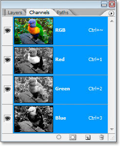
If you are interested in learning more in depth about RGB and color workflow, I have two good resources for you. The first is posted on photoshopessentials.com titled RGB Color and Color Channels Explained. The article breaks down how Photoshop 'sees' color and translates each color in to a number equivalent that represents what our eye perceives as red, blue, or green.

The second is a new self help guide released from Adobe that details the best color workflow in all the new Creative Suite 3 softwares. Kind of a long read, you might want to jump to page 21 if you only use Photoshop. [Via]

These articles should give you a better understanding of how color is created in Photoshop and how to get the best output from your files.

Tuesday, August 14, 2007

Tim Lanterman in 3 man show with a little help from Mighty


Tim Lanterman, John Wagner and Bill Timmerman will be opening a show this week of their most recent work at the Modified Arts gallery in Phoenix. We did the scanning and imaging to help bring Tim's pieces to life. We were very honored to be a part of his artistic process. They are some beautiful images. We wish all of them the best of luck and great success with their show. Opening reception is August 17th between 6 and 9 PM.

Commercial photographers, Tim Lanterman, John Wagner, and Bill Timmerman have produced a second show of their personal work for Kimber Lannings, Modified Arts gallery, downtown Phoenix. The show will open on the 17th of August, a third Friday, and run till the 14th of September. Tim Lanterman will be showing a new color series of panoramic, landscape photographs. The new work is inspired by painters from the Victorian landscape tradition. John Wagner's emotionally rich photographs, which tend to journal his life experience, will include people, landscapes, and urban settings. This show will feature the most current of his toned gelatin silver prints. Bill Timmerman will also be showing a new series of his toned silver prints of images taken during an eight day hike in the Grand Canyon this year. The Canyon is typical subject matter, but these images although on the traditional side, are not what you consider typical. The show titled "Photographs 2" will be open to the public during the third and first Friday's select evenings and by appointment - call 602-462-5516.

Friday, August 10, 2007

DIY 'Snoot' for your flash

This "snoot" is easy to construct. You just need some gaffers tape and foam paper. Then you can customize it as you need to and get dramatic lighting effects, like this one.

All the steps are posted on Instructables.

Speedlite "Snoot"

Learn how to make a "Snoot" for your speedlite flash with easy to find items you may even have around the house!

Step 1

Get gaffer's tape and foam paper. Look in the craft supply area of Hobby Lobby or Michaels to find the foam paper, and if you have friends at the local theatre (plays not movies) you can often get a bit of Gaffers tape at no charge. Else, check with a camera shop that carries lighting supplies.

Thursday, August 09, 2007

Make your images glow with the Orton Effect

This look, called the Orton Effect, was named after Michael Orton a photographer who was the first to use this technique by merging two images together; one in focus the other out of focus. Michael pioneered this method before the days of Photoshop. He originally used slide film to get his results. Now it can be done with a few simple steps in Photoshop, Photoshop Elements, or GIMP. This tutorial posted by PCIN.net is written for Photoshop Elements 5.0.
The Orton Effect - Digital Photography Tip of the Week
  1. Open your image (Image 1)
  2. Duplicate the background layer (Right click on the background layer and choose duplicate) and name that layer Sharp
  3. Create another duplicate of the background layer.
  4. Change the Blending mode of the Sharp Copy to screen
  5. With the Sharp Copy layer selected, right click and choose Merge Down (Image 2)
  6. Right click on the Sharp layer, choose Duplicate and name this layer Out of Focus
  7. On the Filter Menu, choose Blur - Gaussian Blur (Image 3)
    Depending on the resolution of the image you are using, the amount of blue needed will change. Use enough that the shapes are still visible, but detail is not. For this 6.1 Megapixel image, a value of 15.9 was sufficient.
  8. Change the blending mode of the Out Of Focus layer to Multiply. (Image 4)
This effect does a great job on portrait photography as well.

Tuesday, August 07, 2007

Kurney Ramsey wins Director's Award

We were pleased to learn that an image we recently printed for Kurney Ramsey, Jr. won an award. His New Cars piece was given the Director's Award and will be in the Halpert Biennial show at the Turchin Center for the Visual Arts at the Appalachian State University in Boone, NC. until October 6th. You can view a larger version of the image on his website. Or better yet, if you are in North Carolina, stop by the exhibit.
The Halpert Biennial '07 is a national, juried two-dimensional art competition and exhibition program designed to recognize new works by emerging and established artists residing in the United States. It has grown wonderfully over the years and features some of the most exciting new visual art being produced in the country.

Thanks for sharing Kurney! We are happy to be a small part of your success.

Friday, August 03, 2007

Star gazing and astrophotography

Living in the middle of the city I only get to experience a small portion of the wonders the night sky has to offer. I enjoy the convenience of city life, but I am envious of the view that some get every night. Like the residents of Sky Village, a remote community of astro enthusiasts located besides the Chiricahua Mountains southeast of Tucson. Another great place to experience Arizona's night sky is in Flagstaff thanks to their Dark Skies Coalition. It is also home to the Lowell Observatory.

Once submerged in to the complete darkness of night you may be inspired to try some astrophotograhy. Jerry Lodriguss has a great website with impressive galleries that include all the technical data used to create each image. He also has several books that he has written on the subject to help get you started.

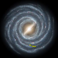
Finally, this image is an artist's rendition of what our own galaxy, the Milky Way, would look like from a distance. This image has been added to our NASA For Sale Gallery. It is available in 20x20 and has one version that shows our solar system's location and one without.

Happy star gazing!

Thursday, August 02, 2007

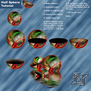
How to make half spheres in Photoshop

Here is a quick step by step tutorial on how to make half spheres in Photoshop courtesy of one of our For Sale Gallery artists, Kerry Randolph. The steps are typed out below. You can also check out this Flickr discussion group page for a larger image of the tutorial. Thanks Kerry!


Half Sphere Tutorial:

1. Make a Sphere
2. Duplicate Layer
3. Make an oval and Fill
4. Select it and Inverse
5. Delete upper half
6. Select inverse again and make a copy of the original sphere and put a motion blur on it to give it a cut in half look.
7. Select soft airbrush at 40% and fill in the bottom area of the oval.
8. Tilt as you wish.

Walla

Tuesday, July 31, 2007

Get published in National Geographic

This is a golden opportunity to have one of your images published in National Geographic magazine. They are holding a photo contest and the winners in 4 categories (people, landscape, animals, and photo essay) will win a digital SLR camera kit, and best of all, will be published in their magazine. The contest begins tomorrow, August 1st and ends October 31st. Review your portfolio for your best shots, and get them entered! For official rules check out this site.

NATIONAL GEOGRAPHIC ANNOUNCES SECOND ANNUAL INTERNATIONAL PHOTOGRAPHY CONTEST Official Press Release
National Geographic readers around the world have the opportunity to take part in the 2007 National Geographic International Photography Contest. And, for the first time, readers of National Geographic's English-language editions in the United States, Australia, New Zealand, Canada and United Kingdom will be able to participate in the contest that was inaugurated in 16 of its local-language editions in 2006.

Friday, July 27, 2007

Charles Brooks receives masters from Professional Photographers of America

We recently worked with Charles Brooks on 4 prints he submitted to the International Print Competition held by the Professional Photographers of America (PPA). If even one of them received high honors he would reach his ultimate goal of earning a Masters of Photography. So, we have been waiting with bated breath for the judges to tally their scores. We just heard today that not just one of his images was selected for exhibit, but all 4. Where Elves Play, the image seen here, was also accepted in to the 2007 PPA loan collection where it will go on a world tour. Way to go, Charles!

The results are in from the Professional Photographers of America International Print Competition, and I am a very happy cowboy!

I can't help but share this with you, because it means that I have now earned, after two years of work, my Masters of Photography through PPA. All four images were accepted for exhibit at the January 2008 PPA National Convention. One in particular, Where Elves Play, was accepted into the PPA 2007 Loan Collection which means that the PPA will publish the image, as well as, include it in their world tour exhibit next year as among the most outstanding images of the year from their membership. This is my fourth Loan Collection print since 2003.

A special thanks to Mighty Imaging who made these prints perfectly for the competition. They do extraordinary work!

Thanks, Charles! We think you do too.

Thursday, July 26, 2007

Typographics

This video put together by Ryan Uhrich and Marcos Ceravolo at the Vancouver Film School is a entertaining illustration on how typography is used in design. The placement of text is a key part of what makes an effective visual graphic. If done wrong, the impact and your emphasis are lost. It is a well done piece and good review whether you are a graphic designer, in advertising & marketing, or just watching for fun.

Tuesday, July 24, 2007

Enlarge your photobooth strips

Remember cramming you and 4 of your friends in to a tiny photobooth making faces at the camera? Ahh memories. Well, it is not too late to recreate one of those days from your youth. Photobooth.net offers a comprehensive list of photobooths that still exist out there waiting for your best silly grin. I was pleased to see that there is one in Phoenix at The Trunk Space. They also offer resource on renting one for your wedding or a big event, like Ron Cowan did for these shots taken at his wedding. They also have listings of movies and TV shows that have used photobooths, books featuring the hazy vignetted shots (MTV's TRL has a great one if you want to see celebrities striking a pose), as well as artists that have utilized photobooths to create their work; most notably Andy Warhol.

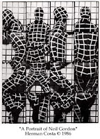
These little strips look amazing when blown up. You can make a large 10x50 panoramic print or cut it in to 2 up strips and place them side by side for a square print. If you are more in to the art side of it, you can montage several shots together for a surreal effect ala Herman Costa. If you have an old strip sitting in a drawer somewhere, making an enlargement of it for your fellow photobooth companions would make a great gift. All you need to do is scan the strip large enough to make the print size you are going for, or we can scan it for you.

Thanks to John Nack for the find. It brings back so many memories.

Wednesday, July 18, 2007

Tips for making your room look bigger

It is a topic that brings a lot of visitors to our blog... How to decorate a room so that it looks bigger? Many of the articles written by interior designers agree. Instead of cramming several smaller items in to an arrangement, use one large piece as your focal point on the wall. Freshome uses this and other suggestions on how to making the room look more spacious.

5 Tips for Fooling the Eye and Making a Room Look Bigger:

In a small space, everything counts.” - That’s the main idea behind this article, and how we can make a small room look bigger, with some clever tricks.

Small rooms can feel confining and uncomfortable. Luckily we can utilize certain design concepts that fool the eye and make our rooms seem much bigger and spacious.

#4 Cut the Clutter

...Don’t cover your walls with a lot of pictures. One large painting [or photograph] works better than a group of small paintings. If there’s too much going on, all clamoring for attention, it can make the room feel busy and crowded. So, when decorating a small room, create a focal point, one area or feature that will draw the eye.

Monday, July 16, 2007

Another good reason to print your images

A couple weeks ago we talked about the importance of printing your images in our Wireless memories? post, so that later on in life when you wonder what happened in 2007 you have more than just a memory card to look at. Here is another excellent reason to print out your images; vanishing media and file formats. Right now jpegs, tiffs, CD's, DVD's, and the various media cards are the standard in saving your files. Can you be sure that it will be the same 20 years from now? Or even 5 years from now? Remember floppy disks and zip drives? Where as the a printed image will look just as good 20 (or even 100) years from now. This article talks about the problem as it relates to libraries and their constant struggle to keep up, but the photography industry is also learning the same painful lesson.

Warning of data ticking time bomb: BBC Technology News

The growing problem of accessing old digital file formats is a "ticking time bomb", the chief executive of the UK National Archives has warned.

Natalie Ceeney said society faced the possibility of "losing years of critical knowledge" because modern PCs could not always open old file formats.

...Ms Ceeney said: "If you put paper on shelves, it's pretty certain it is going to be there in a hundred years.

"If you stored something on a floppy disc just three or four years ago, you'd have a hard time finding a modern computer capable of opening it.

"Digital information is in fact inherently far more ephemeral than paper," warned Ms Ceeney.