Monday, April 30, 2007

Urban surrealism


At first glance you would think Dutch artist Edwin Zwakman's work is trying to find beauty in the urban landscape. What is harder to decipher is that Edwin builds these intricate scenes himself from memory with models. Since it is done from memory, with no other point of reference, each image becomes almost like an alter reality; a city he has created out of his mind.

In this day and age where most people rely on Photoshop to do this kind of construction, it is good to see someone is still doing this sort of thing by hand. It reminds me of all the miniatures made for movie special effects pre-CGI. I can not imagine the time it must have taken to create some of these scenes. Large photographic prints were made for his show in the United Kingdom, Tales from the Grid, which ends on May 6th.

Review by CR Blog; Remodeling the World:

...The 35-year-old Zwakman was recently voted one of the 21 most important photographers of the 21st century by Contemporary Magazine.

"As I reconstruct the world, I work entirely from memory," he explains. "I never use photographs or other reference material. All the places, objects and buildings I have seen morph into new variations. Scale and perspective change as well: the images do not show what one could photograph in such situations, but how one experiences and remembers them."

Friday, April 27, 2007

Worldwide Pinhole Photography Day

The worldwide celebration of pinhole photography is coming up this weekend, April 29th. Time to dust of your SPAMera and get out there and take some funky pinhole images. If you get anything you want to share you can post them to the official Worldwide Pinhole Photography Day website. They have galleries up there from the past 6 years worth of submissions. Better yet, you can get a big print of your favorite image. The eerie quality of these lensless pinhole images is amplified when you enlarge them. Happy shooting!

Tuesday, April 24, 2007

Kevin Dyer featured in Art-Talk

Kevin Dyer is one the artists in our For Sale Gallery. He has beautiful photography that he has collected over his many travels around the world. Some truly stunning images. We are not the only ones that think so. Art-Talk, a publication out of Scottsdale Arizona, that markets to art connoisseurs featured Kevin in their April issue.

Arizona photographer Kevin Dyer began his interest in fine art photography while living in Thailand. "I wanted to document the adventure I was living every day, not just by taking snapshots, but by making photographs that lived up to the inspiration I was feeling. Photographs that would be hanging in my house someday." he says.

He has photographed everything from Thailand to Mt. Everest to Brazil, and his travels have had a profound effect on his work. "For me, there has always been a symbiotic relationship between travel and photography, one inspires me to do the other," says Dyer.

-full story by Alexis Quintana for Art-Talk

Friday, April 20, 2007

What's in a brand?

I came across this blog today authored by C.B. Whittemore: Flooring the Consumer. Although her business is floor finishing, she has many great posts on all aspects of marketing and consumer satisfaction in the shopping experience. In her own words: As Director, In-Store Innovation for Solutia's Wear-Dated carpet fiber, I track consumer trends and am fascinated with digital and brick/mortar retailers who are passionate about meeting the needs of their consumers. I know I will be back to read more on her blog today this particular post caught my eye.
Michael Cape on the Brand Promise:

"The Brand Promise: Connecting With Your Customer Through Marketing, Store Environment and Online" was the subject of Michael Cape's keynote presentation at the December 2006 TREX show in NYC.

At the time of the presentation, Cape was VP of Brand Marketing for JC Penney. He has since accepted the position of EVP for Old Navy [see 2/26/2007 DDI Magazine article Michael Cape Names Old Navy's EVP Marketing].

Exciting changes have taken place at JC Penney during Cape's tenure: the introduction of Sephora as a store within a store, a pop-up store in Times Square, a successful turnaround and expansion. No wonder he has decided to join Old Navy. Things were probably starting to get boring!

Cape started with the following questions. Notice that each one relates to the CONSUMER, not to the store or products.

1. What does the brand stand for in the heart/mind of the consumer?
2. Is your brand relevant to your customer's life?
3. Does your brand make an emotional connection with your customer? [Get away from brand arrogance and build an emotional connection.]
4. Is your brand an inspiration to you customer?

...Cape repeatedly emphasized the criticality of delivering on the brand promise within the store environment. The store entrance should display ceremony and tie into the rest of the brand experience; all brand elements within the store [e.g., light fixtures, the red cube, and 3 different ways to shop] should tie into the campaign. And, don't forget that in-store displays absolutely influence consumers!

How better to convey these points to the customer than through large visual graphics? An image of a bride on her wedding day, a child holding a grown up's hand, or a family having a picnic on a sunny day can catch the viewer's attention and communicate the point right away. It can instantly make an emotional connection with your customer. Adding your brand to the graphics makes the retention of your company name even stronger.

Tuesday, April 17, 2007

Yes, but how will it look on the wall?


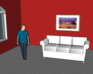
Many photographer's have run across this question from their clients. They love the image and want to buy it, but can not visualize how it will look in their office or living room. Google provides some very useful software that might be able to help you out. SketchUp is a free download and will allow you to build 3 dimensional models of nearly any environment. If you can imagine it, you can draw it out here. There are thousands of models (trees, window frames, sofas, TV's, tables, and so on) available for download and textures and patterns you can apply that will help you make the mock up look more realistic. You can set the parameters of the room to be exactly the same size as their space. You can zoom in and out and view the room in a 360 degree radius.

The software is pretty easy to navigate. If you can use Photoshop, you will be able to use SketchUp. I made this mock up pretty easily never using the software until today.

Wow your clients and use SketchUp on your next print project. It could make the difference between them ordering a 20x24 or a 30x50.

Thanks to Greg Hunter for the tip and Diego Ceja for the image!

Tuesday, April 10, 2007

Art about people viewing art

Photographer Thomas Struth has for the last 20 years been collecting images of museum goers viewing art. He captures most of his images so that the piece of artwork that is being displayed is obscured from the camera's view. All you are left with is the reactions of the viewer to the art that you (as a viewer of Struth's art) can not see. His image Hermitage 1, St. Petersburg with patrons viewing a work by Leonardo can be seen above. Struth printed these large photographs for his latest exhibition "Making Time" at the Marian Goodman Gallery in New York. Full write up by Michael Kimmelman for the New York Times.

Art's Audiences Become Artworks Themselves:

Thomas Struth’s show at Marian Goodman — rapturous, magisterial photographs of museum visitors standing before Velázquez in Madrid and looking at Leonardo at the Hermitage in St. Petersburg — culminates one of the memorable art projects of the last 20 years or so. For nearly that long, Mr. Struth has been making these pictures of people in museums. They’re looking at art, although you might say the real question is what they, and we, are seeing.

The beauty of these pictures is almost a given by now. This current show forms a coda to one lately at the Prado, where Mr. Struth insinuated a dozen or more, some nearly life-size, photographs among the paintings and sculptures. It took some gall and guile. Come upon irregularly and unexpectedly, his pictures punctuated galleries of nearly unrelenting greatness.

Sometimes they intruded. Occasionally, they seemed irrelevant. Mostly they were jarring. I found myself later recalling photographs I had thought forgettable at the time, in the way you may recall somebody you just glimpsed at a museum more vividly than the art.

Monday, April 09, 2007

Hairy situation

If you have ever needed to remove a person from a background with wild locks like this guy, then you know how hard it can be. Here are some great tips posted on photoshopsupport.com. Although this tutorial is for Photoshop Elements, the lesson can be applied to the full version just as easily. Check out the rest of their site. It is full of other useful Photoshop tricks and tutorials.

Selecting & Extracting Hair - Masking Tutorial - Extraction Tips
Adapted from "Adobe Photoshop Elements 5.0 Maximum Performance" by Mark Galer

One of the most challenging montage or masking jobs in the profession of post-production editing is the hair lift. When the model has long flowing hair and the subject needs to change location many post-production artists call in sick. Get it wrong and, just like a bad wig, it shows. Extract filters, Magic Erasers and Tragic Extractors don’t even get us close.

Thursday, April 05, 2007

Light in the tunnel

What an amazing use for large graphics! These advertisements are starting to pop up in subway tunnels around the world. Two companies Submedia and SideTrack are leading the way in this new utilization of, what used to be, dark empty stretches of tunnel thousands of people pass each day. They are created by placing either illuminated prints or LED monitors in succession in the tunnel that when viewed at the right speed from the train look like a movie.

Subway tunnels the latest ad billboards; by Daniel Terdiman, Staff Writer, CNET News.com

If you've been in a subway car in San Francisco, London, Boston, Rio or one of several other cities recently and thought you saw a short film playing along the dark walls of the tunnels, you're not going crazy.

In face, what you saw was one of the latest forms of advertising technology, which is slowly taking over one of transit riders' last refuges from commercial messages....

...And to those in charge of some of the rail systems using the ads, they're working.

"It's everything and more that I wanted it to be," said Graeme Hay, the commercial manager for London's Heathrow Express, which connects the British capital to its main airport. "I've had customers who said to me, 'Wow, that's fantastic. What is it?'"

To see it in action on London's Heathrow Express check out this video.


Tuesday, April 03, 2007

Queen Creek murals leave a Mighty big impression

What was once the quiet, rural, country Town of Queen Creek Arizona is growing so fast that the staff at the City Hall are having a devil of a time just keeping up. The Town wished to purchase three new wall murals that depict the current Town limits, the Town's planning area, and outlying areas. Accuracy was critical since everybody from the Mayor on down would use these murals on a daily basis in assisting with the future build out of their little town.

Brian Sovik, GISP of AMEC Earth and Environmental, Inc. (a worldwide leader in design and project management infrastructure) headed the project with aerial imagery provided by Air Photo USA. Working closely with Ms. Shawny Ekadis, GIS manager of the Town of Queen Creek, Mighty Imaging produced and installed all three 72"x91" murals. These murals, printed on our LightJet were accurate within one millimeter per eight foot of paper and were mounted on 1/8" masonite. After applying a luster laminate we built a bolt together museum back for easy installation.

The vibrancy of the images were incredible and the graphics identifying the Town's limits and future planning areas seemed to jump off the wall. If you want your town to grow start with some Mighty Big Images. Put them out front and center, then watch as one person after another marvels at the future opportunities that become apparent with a large wall mural.

Friday, March 30, 2007

The lens does make a difference

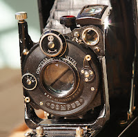
Here is proof that it is not only the processor in your digital camera, but the optics that shoot the image that make a difference in quality. Contessa Nettel Cocarette adapted an old film camera with a Zeiss lens to attach to her digital SLR. Thanks to Make magazine for the find.

Contessa Nettel Concarette with Carl Zeiss Tessar 105mm f/4.5

This is a 6x9 rollfilm camera made by Contessa Nettel (one of the companies which merged to form Zeiss Ikon in 1926). The lens is a Carl Zeiss Jena Tessar 105mm f/4.5, in a dial-set Compur shutter. The camera has rack focusing, meaning that the entire lens assembly moves for focusing. This gives higher image quality than front-element focusing, where only the front element of the lens is moved.

The camera's back doesn't open, but rather the film is first loaded onto an insert that slides into the camera. The back, however, has a small circular door for cleaning the back of the lens.

I removed the circular door from the back of the camera and glued a short (11mm) M42 extension tube in it's place. Now the entire camera can be attached to my DSLR with an M42 adapter, and pictures can be taken through the lens. Thanks to the rack focusing mechanism, infinity focus is possible by not fully extending the bellows. For close-up photography, the bellows work really well for macro extension.

In my initial test shots, the lens has proven to be very sharp.

Based on the serial number of the lens, this camera was probably made in 1923. Certainly before the Zeiss Ikon -merger in 1926.

Be sure to check out her crop comparison of the same image taken with and without the Zeiss adaptation.

Wednesday, March 28, 2007

Mighty Artist honored

Paul Kuhn, one of the artists on our For Sale Gallery, recently received an award for his work. Paul won 1st prize in the professional photography category at the 27th Annual Juried Members Exhibition held by the Sedona Arts Center. In addition to the photography category the competition also awarded prizes for sculpture, painting, ceramics and jewelry in 2 divisions, one for emerging artists and one for professional artists. Paul's winning piece (seen above) is titled Rocky Foursome and was taken at the San Francisco Peaks near Flagstaff. We produced Paul a canvas print with gallery wrap that he submitted for the exhibition. Our congratulations to Paul!

To see more of Paul's work, take a look at his gallery.

Tuesday, March 27, 2007

Creative is NOT a Department

For those of us that work in the photography or graphic design field you know how hard it can be to be "creative" all the time. Anthony Mikes has an article in the Spring issue of Southwest Graphics magazine that acknowledges how important it is to integrate everyone in the office to a imaginative mindset and offered some ideas to keep the creative juices flowing.

Creative is NOT a Department; by Anthony P. Mikes

Not long ago, I did an in-house seminar for a midsize agency. During a discussion of their core strengths, one of the account supervisors said to me that she felt the agency would be a lot better if the creative department could actually meet a deadline and bring forth more economical solutions to clients' problems. Just as I was about to answer, a thought occurred to me...as enlightened a thought as I've had in the past few years.

"Creative" is not a department. Creative is an agency way of life in the 21st century.....

How do you turn your department-oriented agency in to one big creative entity? It's easy. Just follow these steps.

1. Meet regularly to discuss the agency's work.....

2. As you develop your agency's mission and vision, make sure you include points about being a creative organization.....

8. Make your environment creative. What does it hurt to decorate the agency in a creative way? Colors, posters, banners, open space and collaborative areas all inspire your entire organization to be creative, not just the few people in the creative department.
The full article can be found at www.secondwindonline.com, but you have to register with them to read it.

Friday, March 23, 2007

Is it fine art if it is created in the computer?

Much like when photography first entered the art scene, digital art is now challenging many people's conception about the definition of fine art. This is a great write up from the people at We Make Money Not Art blog.

A conversation about exhibiting and selling digital fine art:
Reto and i stepped out of the gallery and wondered whether a space that focuses on digital art was viable. Does it follow the same economical model as any other gallery? Does it have a market? A future? [DAM] is a bit isolated in the art gallery landscape (at least in Europe as New York, for example, has Bitforms and the Bryce Wolkowitz Gallery) so how does it work? I then decide to contact Wolf Lieser, the gallery owner and curator, and asked him if he'd find some time to answer my questions. I'll never thank him enough for his enthusiasm, the way he supports and promotes digital artists and for reminding me that the discipline is already some 40 years old. Here's an overview of our conversation....


To check out some digital art from one of our Mighty Artist's take a look at Bonnie Mitchell's gallery.

Wednesday, March 21, 2007

Photo blog 100 years in the making

Shorpy.com has a collection of images taken by Lewis Wickes Hine that shows what life was like 100 years ago (before child labor laws). It is an interesting history lesson. Maybe you can show it to your kid the next time they complain about not having enough iTunes credit. Thanks to Make Magazine Blog for the find.

Shorpy.com is a photo blog about what life a hundred years ago was like: How people looked and what they did for a living, back when not having a job usually meant not eating. We’re starting with a collection of photographs taken in the early 1900s by Lewis Wickes Hine as part of a decade-long field survey for the National Child Labor Committee, which lobbied Congress to end the practice. One of his subjects, a young coal miner named Shorpy Higginbotham, is the site’s namesake.

Tuesday, March 20, 2007

Recent additions

We have added some new artists to our For Sale Gallery lately. Both offer distinctive and very different outlooks on the world around them.

Cyndi Stamm's work ranges from beautiful shots from her many travels to abstract studies of light and line. Her images looks fantastic on the Metallic paper. To see more of Cyndi's work check out her gallery.


Tim Roberts offers a perspective from thousands of feet in the air. Tim does a lot of his shooting from a helicopter as an aerial photographer. He has some unique shots of the South and Southwest taken from above. He also has some wonderful nature shots taken with both feet planted firmly on the ground. Check out Tim's gallery here.

Friday, March 16, 2007

With a little help from Adobe

Who needs scholarship money if you can score some from Adobe? If you know any stellar photography or design students give them the heads up.

The Adobe® Design Achievement Awards celebrate student achievement reflecting the powerful convergence of technology and the creative arts. The competition — which showcases individual and group projects created with industry-leading Adobe creative software — honors the most talented and promising student graphic designers, photographers, illustrators, animators, digital filmmakers, and computer artists from the world's top institutions of higher education.

International prestige and valuable prizes

The 2007 Adobe Design Achievement Awards competition is open to students at post-secondary institutions in 30 countries throughout the world. First-place winning entries will receive US$5,000, a trip to attend the awards ceremony, valuable Adobe software products, and studio tours.

Show off your talent and creativity. Submit your entry now.

Monday, March 12, 2007

Lost and found

Here is a inventive way to use big photos. Last December artist Beth Arnold posted these posters all over Melbourne of discarded objects to try to match them with their owner. Although the posters are down now, the idea and the website still live on. Check out the Discarded Object Poster Project site. Review by Guerrilla Innovation.

Have you ever seen a single shoe in the gutter, a beanie on the road, or a glove on the tram, and thought about whom the object may have belonged to, and how it got lost?

If yes, then you will love the Discarded Object Poster Project.

Discarded Object Poster Project is an urban artwork by Beth Arnold devoted to lonely deserted objects that we tend to notice, only to forget about them soon after.

The artist recently invited people in Melbourne to submit photographs of discarded objects along with information about their location. The images will then be made into high-quality posters and posted around the city.

Walking tours to view posters will take place at the opening on Thursday December 12th.

Friday, March 09, 2007

Need something to do this weekend?

It is that magical time of year here in Arizona. That brief window of time after the winter rain and before the blistering heat hits when the desert comes to life with beautiful blooms. It is fleating, so catch it while you can. Arizona Highways magazine has posted a list of places to visit if you are planning a weekend excursion.

Expanded Wildflower Guide: by Michael Famiglietti and JoBeth Jamison

The sun makes its summer approach as winter moitsture melts into the ground, finding its way south to feed the desert seeds of Arizona's wildflower display. Perhaps one of nature's most unpredictable arts, wildflower-watching can be fruitless as it can be fantastic....

Wednesday, March 07, 2007

Leave 'em hanging

Do you have a blank wall that could use a new look? Or maybe you just need to freshen up your current art arrangement. This article from HGTV can help you out, or give you some inspiration to try a new design.

Designing and Hanging an Art Collage
First, pull together items that have something in common. All-gold frames with black-and-white images would tie unlike subject matter together. Then, add a couple items with some dimension, like a gold wall sconce with a candle on it, or a gold framed mirror. Don't overdo the variety so that the common thread of the grouping is lost.

Once the items have been collected, start arranging them in a space equal to the space available on the wall, but working on the floor. It's very easy to move things around and get a feel for the overall effect when you can work in an open area on the floor.

Now, how does the collage get from floor to wall? Just grab a couple of brown paper grocery bags, a pencil and a pair of scissors...

Friday, March 02, 2007

Fun weekend read


We wind up printing a lot of aerial photography here because of the LightJet's amazing ability to image fine detail accurately. This 1920 publication by Herbert Eugene Ives entitled Airplane Photography shows you how far the industry has progressed. Check out the huge camera and mountings they would use on to a bi-wing plane. Not quite the same as a hanging out of a helicopter with a digital camera. Thanks to Make Magazine for the find.

Airplane photography - 1920's
Here's a great 400+ page book (free) for download from the 1920's on airplane photography - Airplane Photography - Google Book Search - Link.