Tuesday, August 28, 2007

Now that is big

This is the largest photograph ever produced in one sheet. The Legacy Project turned an aircraft carrier in to a camera obscura and hand applied the emulsion to a custom made canvas to create it. The specs on what it took to make this image are mind boggling.

The Legacy Project to Exhibit the World’s Largest Photograph -Photo Reporter

The world’s largest photograph, the Great Picture, which is 3,375 square feet, premiers at Pasadena’s Art Center College of Design at the South Campus Wind Tunnel Gallery in a showing that will be held September 6–29, 2007.


Only a handful of museums are large enough to display the photograph, which is a history-making gelatin silver image 3 stories high by 11 stories wide. The photograph was created over nine months in 2006 by six well-known photographic artists collectively known as The Legacy Project and 400 volunteers, artists and experts. The $65,000 photograph was made using a shuttered Southern California F-18 jet aircraft hangar transformed into a gigantic camera obscura. The largest camera ever made, it measures 44' 2" high by 79' 6" deep by 161' 6" wide. To darken the hanger, 24,000 square feet of 6 mil black viscuine, 1,300 gallons of foam gap filler, 1.52 miles of black gorilla tape and 40 cans of black spray paint were needed. The aperture was a one-quarter inch (6mm) pinhole 15 feet above ground level, with no lens or other optics used.


Working in their jet hangar/camera, the group hand-applied 80 liters of gelatin silver halide emulsion to a seamless 107' 5" by 31' 5" canvas substrate custom made in Germany. Development was done in an Olympic-pool-size developing tray using 10 submersible pumps and 1,800 gallons of black-and-white chemistry.


The Guinness Book of Records preapproved and is now evaluating applications in two categories: world’s largest photograph and camera.

Friday, August 24, 2007

Big and small


Akiko Ida and Pierre Javelle got their start in food and commercial photography. They met at the Paris "Arts Decoratifs" art school and blended their styles to create these truly unique miniature fantasy worlds under the name minimaim. What better to showcase the detail in their small set ups than large prints. The contrast between the big and small is perfectly illustrated. The image below is from an exhibition they had in 2005 at the Fraich Attitude gallery in Paris. Their website is full of whimsical images that will have you imagining that your food has a secret life after you go to bed at night. [Found via Design *Sponge]

Wednesday, August 22, 2007

Helvetica and beyond

This poster would be a perfect addition to any graphic design office. Even if you can't read the language, I am sure you are familiar with Helvetica. It is a great collection that showcases the history of Swiss graphic design. The high-res pdf generously supplied for download can produce a pretty large poster. Hmmm....I think I might know a place that could print it for you. [Found via Creative Review]

89 Swiss Poster Posted by Xavier Encinas (on the Swiss Legacy blog)

Last year when Richard Hollis released his new book, Swiss Graphic Design: The Origins and Growth of an International Style, 1920–1965, Jannuzzi Smith organised a presentation, discussion forum, and book launch. For this occasion, Jannuzzi Smith designed a poster using all the illustrations of the book. A very useful tool to have always around.

Tuesday, August 21, 2007

How Flickr could help fix your photo

James Hays and Alexei Efros, a research team from Carnegie Mellon University, have developed an algorithm that will analyze the millions of images posted on photo sharing sites (like Flickr) to replace a portion of an image that may have been obstructed or you would like removed. The algorithm then sorts out the possible images to be used based on the orientation of the object, the light source, the height of the camera used to take the picture, and the color shades of the image that will best match the original.


Photo tool could fix bad images: by Mark Ward for BBC Technology News

To find suitable matching elements, the research duo's algorithm looks through a database of 2.3 million images culled from Flickr.

"We searched for other scenes that share as closely as possible the same semantic scene data," said Mr. Hays, who has been showing off the project at the computer graphics conference Siggraph, in San Diego.

In this sense "semantic" means composition. So a snap of a lake in the foreground, hills in the band in the middle and sunset above has, as far as the algorithm is concerned, very different "semantics" to one of the city with a river running through it.

The broad-based analysis cuts out more than 99.9% of the images in the database, said Mr. Hays. The algorithm then picks the closest 200 for further analysis.

Next the algorithm searches the 200 to see if they have the elements, such as hillsides or even buildings, the right size and colours for the hole to be filled.

The useful parts of the 20 best scenes are then cropped, added to the image being edited so the best fit can be chosen.

Early tests of the algorithm show that only 30% of the images altered with it could be spotted, said Mr. Hays.

Friday, August 17, 2007

Color deconstructed

If you are interested in learning more in depth about RGB and color workflow, I have two good resources for you. The first is posted on photoshopessentials.com titled RGB Color and Color Channels Explained. The article breaks down how Photoshop 'sees' color and translates each color in to a number equivalent that represents what our eye perceives as red, blue, or green.

The second is a new self help guide released from Adobe that details the best color workflow in all the new Creative Suite 3 softwares. Kind of a long read, you might want to jump to page 21 if you only use Photoshop. [Via]

These articles should give you a better understanding of how color is created in Photoshop and how to get the best output from your files.

Tuesday, August 14, 2007

Tim Lanterman in 3 man show with a little help from Mighty


Tim Lanterman, John Wagner and Bill Timmerman will be opening a show this week of their most recent work at the Modified Arts gallery in Phoenix. We did the scanning and imaging to help bring Tim's pieces to life. We were very honored to be a part of his artistic process. They are some beautiful images. We wish all of them the best of luck and great success with their show. Opening reception is August 17th between 6 and 9 PM.

Commercial photographers, Tim Lanterman, John Wagner, and Bill Timmerman have produced a second show of their personal work for Kimber Lannings, Modified Arts gallery, downtown Phoenix. The show will open on the 17th of August, a third Friday, and run till the 14th of September. Tim Lanterman will be showing a new color series of panoramic, landscape photographs. The new work is inspired by painters from the Victorian landscape tradition. John Wagner's emotionally rich photographs, which tend to journal his life experience, will include people, landscapes, and urban settings. This show will feature the most current of his toned gelatin silver prints. Bill Timmerman will also be showing a new series of his toned silver prints of images taken during an eight day hike in the Grand Canyon this year. The Canyon is typical subject matter, but these images although on the traditional side, are not what you consider typical. The show titled "Photographs 2" will be open to the public during the third and first Friday's select evenings and by appointment - call 602-462-5516.

Friday, August 10, 2007

DIY 'Snoot' for your flash

This "snoot" is easy to construct. You just need some gaffers tape and foam paper. Then you can customize it as you need to and get dramatic lighting effects, like this one.

All the steps are posted on Instructables.

Speedlite "Snoot"

Learn how to make a "Snoot" for your speedlite flash with easy to find items you may even have around the house!

Step 1

Get gaffer's tape and foam paper. Look in the craft supply area of Hobby Lobby or Michaels to find the foam paper, and if you have friends at the local theatre (plays not movies) you can often get a bit of Gaffers tape at no charge. Else, check with a camera shop that carries lighting supplies.

Thursday, August 09, 2007

Make your images glow with the Orton Effect

This look, called the Orton Effect, was named after Michael Orton a photographer who was the first to use this technique by merging two images together; one in focus the other out of focus. Michael pioneered this method before the days of Photoshop. He originally used slide film to get his results. Now it can be done with a few simple steps in Photoshop, Photoshop Elements, or GIMP. This tutorial posted by PCIN.net is written for Photoshop Elements 5.0.
The Orton Effect - Digital Photography Tip of the Week
  1. Open your image (Image 1)
  2. Duplicate the background layer (Right click on the background layer and choose duplicate) and name that layer Sharp
  3. Create another duplicate of the background layer.
  4. Change the Blending mode of the Sharp Copy to screen
  5. With the Sharp Copy layer selected, right click and choose Merge Down (Image 2)
  6. Right click on the Sharp layer, choose Duplicate and name this layer Out of Focus
  7. On the Filter Menu, choose Blur - Gaussian Blur (Image 3)
    Depending on the resolution of the image you are using, the amount of blue needed will change. Use enough that the shapes are still visible, but detail is not. For this 6.1 Megapixel image, a value of 15.9 was sufficient.
  8. Change the blending mode of the Out Of Focus layer to Multiply. (Image 4)
This effect does a great job on portrait photography as well.

Tuesday, August 07, 2007

Kurney Ramsey wins Director's Award

We were pleased to learn that an image we recently printed for Kurney Ramsey, Jr. won an award. His New Cars piece was given the Director's Award and will be in the Halpert Biennial show at the Turchin Center for the Visual Arts at the Appalachian State University in Boone, NC. until October 6th. You can view a larger version of the image on his website. Or better yet, if you are in North Carolina, stop by the exhibit.
The Halpert Biennial '07 is a national, juried two-dimensional art competition and exhibition program designed to recognize new works by emerging and established artists residing in the United States. It has grown wonderfully over the years and features some of the most exciting new visual art being produced in the country.

Thanks for sharing Kurney! We are happy to be a small part of your success.

Friday, August 03, 2007

Star gazing and astrophotography

Living in the middle of the city I only get to experience a small portion of the wonders the night sky has to offer. I enjoy the convenience of city life, but I am envious of the view that some get every night. Like the residents of Sky Village, a remote community of astro enthusiasts located besides the Chiricahua Mountains southeast of Tucson. Another great place to experience Arizona's night sky is in Flagstaff thanks to their Dark Skies Coalition. It is also home to the Lowell Observatory.

Once submerged in to the complete darkness of night you may be inspired to try some astrophotograhy. Jerry Lodriguss has a great website with impressive galleries that include all the technical data used to create each image. He also has several books that he has written on the subject to help get you started.

Finally, this image is an artist's rendition of what our own galaxy, the Milky Way, would look like from a distance. This image has been added to our NASA For Sale Gallery. It is available in 20x20 and has one version that shows our solar system's location and one without.

Happy star gazing!

Thursday, August 02, 2007

How to make half spheres in Photoshop

Here is a quick step by step tutorial on how to make half spheres in Photoshop courtesy of one of our For Sale Gallery artists, Kerry Randolph. The steps are typed out below. You can also check out this Flickr discussion group page for a larger image of the tutorial. Thanks Kerry!


Half Sphere Tutorial:

1. Make a Sphere
2. Duplicate Layer
3. Make an oval and Fill
4. Select it and Inverse
5. Delete upper half
6. Select inverse again and make a copy of the original sphere and put a motion blur on it to give it a cut in half look.
7. Select soft airbrush at 40% and fill in the bottom area of the oval.
8. Tilt as you wish.

Walla

Tuesday, July 31, 2007

Get published in National Geographic

This is a golden opportunity to have one of your images published in National Geographic magazine. They are holding a photo contest and the winners in 4 categories (people, landscape, animals, and photo essay) will win a digital SLR camera kit, and best of all, will be published in their magazine. The contest begins tomorrow, August 1st and ends October 31st. Review your portfolio for your best shots, and get them entered! For official rules check out this site.

NATIONAL GEOGRAPHIC ANNOUNCES SECOND ANNUAL INTERNATIONAL PHOTOGRAPHY CONTEST Official Press Release
National Geographic readers around the world have the opportunity to take part in the 2007 National Geographic International Photography Contest. And, for the first time, readers of National Geographic's English-language editions in the United States, Australia, New Zealand, Canada and United Kingdom will be able to participate in the contest that was inaugurated in 16 of its local-language editions in 2006.

Friday, July 27, 2007

Charles Brooks receives masters from Professional Photographers of America

We recently worked with Charles Brooks on 4 prints he submitted to the International Print Competition held by the Professional Photographers of America (PPA). If even one of them received high honors he would reach his ultimate goal of earning a Masters of Photography. So, we have been waiting with bated breath for the judges to tally their scores. We just heard today that not just one of his images was selected for exhibit, but all 4. Where Elves Play, the image seen here, was also accepted in to the 2007 PPA loan collection where it will go on a world tour. Way to go, Charles!

The results are in from the Professional Photographers of America International Print Competition, and I am a very happy cowboy!

I can't help but share this with you, because it means that I have now earned, after two years of work, my Masters of Photography through PPA. All four images were accepted for exhibit at the January 2008 PPA National Convention. One in particular, Where Elves Play, was accepted into the PPA 2007 Loan Collection which means that the PPA will publish the image, as well as, include it in their world tour exhibit next year as among the most outstanding images of the year from their membership. This is my fourth Loan Collection print since 2003.

A special thanks to Mighty Imaging who made these prints perfectly for the competition. They do extraordinary work!

Thanks, Charles! We think you do too.

Thursday, July 26, 2007

Typographics

This video put together by Ryan Uhrich and Marcos Ceravolo at the Vancouver Film School is a entertaining illustration on how typography is used in design. The placement of text is a key part of what makes an effective visual graphic. If done wrong, the impact and your emphasis are lost. It is a well done piece and good review whether you are a graphic designer, in advertising & marketing, or just watching for fun.

Tuesday, July 24, 2007

Enlarge your photobooth strips

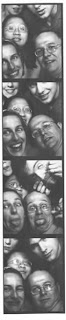
Remember cramming you and 4 of your friends in to a tiny photobooth making faces at the camera? Ahh memories. Well, it is not too late to recreate one of those days from your youth. Photobooth.net offers a comprehensive list of photobooths that still exist out there waiting for your best silly grin. I was pleased to see that there is one in Phoenix at The Trunk Space. They also offer resource on renting one for your wedding or a big event, like Ron Cowan did for these shots taken at his wedding. They also have listings of movies and TV shows that have used photobooths, books featuring the hazy vignetted shots (MTV's TRL has a great one if you want to see celebrities striking a pose), as well as artists that have utilized photobooths to create their work; most notably Andy Warhol.
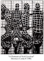
These little strips look amazing when blown up. You can make a large 10x50 panoramic print or cut it in to 2 up strips and place them side by side for a square print. If you are more in to the art side of it, you can montage several shots together for a surreal effect ala Herman Costa. If you have an old strip sitting in a drawer somewhere, making an enlargement of it for your fellow photobooth companions would make a great gift. All you need to do is scan the strip large enough to make the print size you are going for, or we can scan it for you.

Thanks to John Nack for the find. It brings back so many memories.

Wednesday, July 18, 2007

Tips for making your room look bigger

It is a topic that brings a lot of visitors to our blog... How to decorate a room so that it looks bigger? Many of the articles written by interior designers agree. Instead of cramming several smaller items in to an arrangement, use one large piece as your focal point on the wall. Freshome uses this and other suggestions on how to making the room look more spacious.

5 Tips for Fooling the Eye and Making a Room Look Bigger:

In a small space, everything counts.” - That’s the main idea behind this article, and how we can make a small room look bigger, with some clever tricks.

Small rooms can feel confining and uncomfortable. Luckily we can utilize certain design concepts that fool the eye and make our rooms seem much bigger and spacious.

#4 Cut the Clutter

...Don’t cover your walls with a lot of pictures. One large painting [or photograph] works better than a group of small paintings. If there’s too much going on, all clamoring for attention, it can make the room feel busy and crowded. So, when decorating a small room, create a focal point, one area or feature that will draw the eye.

Monday, July 16, 2007

Another good reason to print your images

A couple weeks ago we talked about the importance of printing your images in our Wireless memories? post, so that later on in life when you wonder what happened in 2007 you have more than just a memory card to look at. Here is another excellent reason to print out your images; vanishing media and file formats. Right now jpegs, tiffs, CD's, DVD's, and the various media cards are the standard in saving your files. Can you be sure that it will be the same 20 years from now? Or even 5 years from now? Remember floppy disks and zip drives? Where as the a printed image will look just as good 20 (or even 100) years from now. This article talks about the problem as it relates to libraries and their constant struggle to keep up, but the photography industry is also learning the same painful lesson.

Warning of data ticking time bomb: BBC Technology News

The growing problem of accessing old digital file formats is a "ticking time bomb", the chief executive of the UK National Archives has warned.

Natalie Ceeney said society faced the possibility of "losing years of critical knowledge" because modern PCs could not always open old file formats.

...Ms Ceeney said: "If you put paper on shelves, it's pretty certain it is going to be there in a hundred years.

"If you stored something on a floppy disc just three or four years ago, you'd have a hard time finding a modern computer capable of opening it.

"Digital information is in fact inherently far more ephemeral than paper," warned Ms Ceeney.

Thursday, July 12, 2007

Personalized music poster

This would be a great gift idea for any music lover. Or just a cool way to make a personal statement using your favorite bands as the backdrop. We would be happy to print it, of course.

Make a huge printable poster from your iTunes album art!

This is a instructable describing how to cumbersomely export your existing iTunes album art and arrange all the covers into a huge grid, leaving you with a gigantic, colourful and vibrant mishmash of popular culture ready for printing and, maybe later, your wall!

I decided I wanted to do this a couple of nights ago and now I've come up with a method, it's not really complicated but can be rather time-consuming depending on how large your library is.
I have around 800 albums with attached album art and it took at least an hour, granted most of that time is spent watching your computer doing all the work for you.

The process requires you to download some free applications (links supplied) and you also need a new-ish version of Photoshop (I use CS3) although I'll show you an alternate way of getting basically the same results with Google's free digital photo organizer, Picasa2.

Tuesday, July 10, 2007

You can't keep me in a box

That is Kerry Randolph's moto. Kerry is a digital artist, and after looking at his work you will see what he means. Kerry recently joined the group of artists offering work on our For Sale Gallery. His work is unique to say the least. They are almost like looking in to an alternate universe. To see Kerry's work visit his gallery. Kerry has many more images than we could fit on his gallery, to see his entire portfolio you can visit his Flickr page. All of them are available for purchase.

Kerry Randolph does some of the most amazing Digital artwork that I have ever seen. His imagination is endless, and he astounds me each and every time I view his work. His use of color, form, texture and sense of movement are incredible. I can never wait to see what he’ll come up with next. Each piece of his art is complex and takes a long time to absorb. When you really look at his work, small details pop out that you don’t see at first.

Monday, July 09, 2007

Paint like a master


In Photoshop that is. Or you could use Illustrator, InDesign or GoLive for that matter. Dr. Woohoo, a New Mexico based artist and designer, has built a pretty amazing website called In The Mod. There he has deconstructed several different master works by well known artists to their most basic element; color. You can download the color palette of your favorite artist directly in to Photoshop or Illustrator as a .ASE file and build your own masterpiece. Or perhaps you were so inspired by Cezanne's painting of Mont Sainte-Victoire that you want to decorate your room in the same colors. Well, you can download the palette here. There are also tools that will connect the similarities in color palettes between the painting you are viewing and all the other paintings in their large database. Some fun stuff to play around with or good place to find inspiration for your next design project.