"Impossible" Becomes Possible with Zigview: Picture Business Magazine May '08 issue
Talk about having fun with a product launch – Argraph Corporation has never stopped having a blast with their unique Zigview product, launched last year. The product, rotating, tilting real-time digital viewfinder for DSLRs, was well received in the imaging industry and the company has run several interesting promos around the p[product since its launch. The most recent marketing commotion is the response Argraph has gotten from asking Zigview users to send in some of the more interesting images the product is allowing to capture. The company claims, “Photos are pouring in from enthusiastic photographers around the world. They’re taking shots they never thought were possible. And they’re posting the incredible results on the “How Do You Zigview?” page of the Argraph Corp. website.”
Monday, June 30, 2008
Get the "big" shot in a big crowd
Unless you are a press photographer with clearance, most likely when attending a sporting event your seats are not front row. Or say a parade, graduation, red carpet, really any situation where you are trying to photograph around something blocking your view. Sure you can use a monopod to elevate your camera above the what is obstructing your shot, but how do you know what you are getting? The Argraph Corporation launched a product called Zigview that can help. It is a real time digital viewfinder for DSLRs that allows for a lot more freedom when shooting. The company also has a site where fans of the product can share their images of once "impossible to get shots" called How Do You Zigview? Now you don't have to miss the "big" shot when stuck in a big crowd.
Labels:
camera,
camera accessory,
digital camera,
technology
Friday, June 27, 2008
Write your name with pictures
This is real cute and creative way to make a wall art piece that is all about you. This would be great for a kid's bedroom or playroom. No need to limit it to just a name. Spell out any word to fit the area you are designing.
Creative Wall Art: Your Name in Pictures: Design Talk
Here’s a creative idea for your walls that displays a name in a unique and artistic way. Because a picture (or 10 pictures, in our case) is worth a thousand words, why don’t we just show you the example first:What we did. We chose photos of each of the letters in “DesignTalk,” then framed and hung them together to make a personalized photo arrangement.
How we did it. You can go so many directions with this idea. For example:Pick your word:
- a family last name for a living room, kitchen, or entryway
- a child’s name for a bedroom
- a teen’s nickname for a teen room
- a word to coordinate with a theme room (for example, “kick” for a soccer room, “fashion” for a fashion bedroom, “princess” for a little girl’s room, etc.)
- a sports team name for a basement, den, or game room (choose pictures from sports venues to complete the look)
- a business name for an office
- an inspirational word for a home office, home gym, homeschool room, or classroom
Pick your photos:
- Take your own pictures of shapes around your home or town that form the letters in your name (see an example here).
- Enlist your children to help you seek out letters they like to create a name for their room.
- Visit a photo site like istockphoto to search out photos in colors or themes you’re looking for.
Print your photos:
Use your favorite photo printer [We are assuming this means Mighty Imaging] to order the photos in the sizes you’re looking for. If you have the wall space, an easy arrangement would be to order 8×10″ photos and hang them in coordinating frames.
Labels:
decorating,
design,
framing,
interior design,
photography,
project idea
Wednesday, June 25, 2008
Barbara Bosworth retropsective at PAM
The Phoenix Art Museum (PAM) will be showing the work of Barbara Bosworth in the show entitled Human Nature: The Photographs of Barbara Bosworth at their Norton Photography Gallery until July 27, 2008. It is Bosworth's first exhibition in the American Southwest. The show includes more than 40 photographs, spanning nearly 20 years of the photographer's career.
It looks like Barbara also likes to use big prints to accentuate the impact of her work. One of the images debuting at the show is of a meadow that was printed to a 'commanding scale' designed to envelop the viewer.
It is that time of year here in Phoenix where people are looking for any way to beat the heat. Spend the day at the museum and see some great art to boot.
Human Nature presents the contemporary landscape photographs of Barbara Bosworth. Drawing together nearly twenty years of work, the exhibition demonstrates Bosworth's ongoing interest in people's presence in nature. She focuses on points of contact: bird-banders and their fragile catch, rifle hunters and their prey, lush green meadows marked by tire tracks, and the magic of natural phenomena easily overlooked: birds' nests, soap bubbles, an eclipse. Her photographs reflect the beauty she finds all around her, from a tiny bass swimming in a jar to the dramatic power of a pounding waterfall.
This is Bosworth's first exhibition in the American Southwest and features more than 40 prints, including both color and exquisitely printed gelatin silver photographs.
In addition, Human Nature will debut a monumental print of an overgrown meadow; shown on such a commanding scale, its deep green foliage immerses viewers in another world.
Monday, June 23, 2008
Creating custom repeating patterns
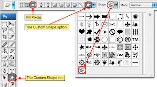
PS Hero is a site dedicated to Photoshop tutorials. In this tutorial they give a simple step by step on how to create your own custom repeating pattern by using the Custom Shape Tool. If you would like more choices than what is standard in Photoshop, they even have links posted for free custom shapes available for download.
Although the tutorial was not written with this in mind, we thought another great use of this technique would be to create your own wallpaper design for your home, office, or studio. The possibilities are endless, and what a great way to add a subtle touch and personalize your space.
Creating Custom Patterns
In this Photoshop tutorial we will explore the wonderful world of repeating patterns while creating one from scratch using a Photoshop Custom Shape.
Friday, June 20, 2008
Lighting Essentials Workshops
For many of us weekend warriors trying blend the correct exposure with the proper lighting technique is as much about understanding principles as it is mastering the knowledge.
Our friend Don Giannatti has been a bit of a local legend when it comes to addressing the unique challenges that come when you have a passion for photography. Well it appears that Don’s legend has gone nationwide as he has taken his knowledge (and his muse) on the road for a series of workshops that cover everything from the technical to the creative.
From Houston Texas to Chicago, from Boston to Portland Maine the lighting essentials workshops have been packing them in. I think the reason for his success is the fact that Don’s "not interested in auto settings or sticking a flash on your camera and clicking away. At the workshops you will learn to do it with manual strobes, manual settings and attention to detail that is the mark of a professional photographer."
At Lighting-Essentials.com you will find not just the workshop info, but all kinds of cool ideas and tons of inspiration.
So, as you sit around surfing the net all summer ask yourself; are you ready to redefine your photography? Do you want to beat the heat and learn to invest in yourself not just in equipment? If so grab your digital SLR and all the lenses that you can find, head out to San Diego on the 12th. of July to catch Don and his crew and learn how to see the light that only you can create!
Labels:
lighting,
photography,
photography workshop,
project idea
Wednesday, June 18, 2008
Lindsay Palmer & Rebekah Brems collaboration
The GREENBELT is a show opening this weekend at the eye lounge that is a collaboration of two very talented fine art photographers Lindsay Palmer and Rebekah Brems. We were honored to do the printing for the show. The concept for the show is a new take on what is considered 'traditional' landscape photography. The images looked amazing, I know the final installation of the work will bring all the aspects together in a truly unique way.
This is also the last show before Lindsay embarks on her grand adventure to the Big Apple for graduate school. We wish her all the best in her endeavors!
Local photographers, Rebekah Brems and Lindsay Palmer, present a collaborative exhibition of contemporary, large-scale photographic works at eye lounge: a contemporary art space in downtown Phoenix. This photographic installation pushes the conceptual boundaries of landscape photography by physically and symbolically deconstructing popular subjects of the traditional landscape in visual art. The G R E E N B E L T reassembles natural imagery in provocative ways, focusing on an ongoing narrative mankind maintains with our environment.
The G R E E N B E L T is on display from June 20, through July 12, 2008.
A FREE, PUBLIC reception will be held at eye lounge on June 20, from 5 p.m. to 10 p.m.
First Friday art-walk will take place the Friday, July 4, 2008.
eye lounge: a contemporary art space, is located at 419 East Roosevelt Street in the heart of the Roosevelt Row Arts district in downtown Phoenix. Regular gallery hours are Fridays from 5-9 pm and Saturdays from 1-5 p.m. Eye lounge is a collective, artist-run, contemporary art space committed to fostering local emerging and established visual artists.
Labels:
art,
art show,
artist reception,
emerging artists,
first friday,
phoenix,
photography
Monday, June 16, 2008
Arizona Game and Fish photo contest
The Arizona Game and Fish Department is now accepting photos for their 3rd annual calendar photo contest. Thirteen winning photos will receive a cash prize and will also be used for their 2009 Arizona Wildlife Calendar. All photos must be taken in Arizona. No more than 2 photos from one photographer are eligible to win.
Last year 630 photos were entered. One of our Mighty Artists, Leon Ritchie, won first place in the fish category for their 2007 calendar, see post here. Submissions of 8x10 photo prints or digital images must be received by 5 PM on July 7th. Each contestant may submit up to 12 entries.
For more information and entry forms visit the Arizona Game and Fish website. Good luck!
Thursday, June 12, 2008
How to recover deleted files
What do you do if your computer crashes or you accidentally delete a file you need? Years worth of information could be lost in an instant. There are file recovery services that will try to salvage the lost information. The outcome is not guaranteed and it often comes with a hefty price tag. Lifehacker has shared some free softwares available for PC's that you might want to try before you spend hundreds at an outside service. There is also have a link for a Mac software for a nominal fee. It's better than crying on the keyboard.
How to Recover Deleted Files with Free Software
Ack! The computer ate my term paper! We've all been there at some point. You delete an important file, somehow it skips your Recycle Bin altogether, and for all practical purposes, it's disappeared into the ether. But before you hit the big red panic button, there's a very good chance that your file is still alive and kicking somewhere on your hard drive—you just need to know how to find it. With the right tools, finding and recovering that deleted file can be as simple as a few clicks of your mouse.
Tuesday, June 10, 2008
How to save money and have eye catching trade booth graphics
When designing a trade show booth it is all about attracting interest. When faced with so much information and so many choices what will make you stand out from the rest? One way is with killer graphics that will grab the attention of your audience. Unless you are big corporation that can afford to hire your own photographer; how do you find images that will motivate, and also be big enough to create high quality graphics needed for your booth? That is where stock photos can help. This article by Evan D. Owen of A Smash Hit! explains the different types of stock photos, and which will work best for your needs. You don't necessarily need to spend thousands of dollars to get an image that will draw in the crowds. Found [Via].
A picture is worth a thousand.....dollars! How to Save Big Bucks in Purchasing High Quality Stock Photos by Evan D. Owen president of A Smash Hit! Trade Show Displays
Pictures and graphics are one of the most important elements that a company uses to create brand awareness and communicate its message. Ever wonder where those images come from? The general term for these images is “stock photos” and the evolution of digital photography has caused a revolution within the stock photo industry. In our business of selling trade show displays and designing graphics for these displays we are constantly challenged with how to develop a graphical message that is suitable for trade show graphics. Trade show graphics are considered large format printing and it has its own set of challenges, especially when it comes to finding high resolution photos that when printed look presentable.
Friday, June 06, 2008
Tyson Crosbie book signing
Tyson Crosbie is one prolific artist. On May 15th he released his latest series of fine art photography focusing on his new home, Phoenix. He has now published a book to correspond with the Phoenix series entitled Phoenix 20. Tyson will be having a book signing party at his house on Saturday June 14th. Details about the event are posted here. If you wish to attend, please RSVP Tyson.
If you cannot attend the event, and would like to purchase a book, they are available through the link below on Tyson's blog.
Tyson Crosbie "Phoenix 20" Book Signing
This is as much a celebration of an personal accomplishment as it is a gathering of community. Tyson Crosbie published “Phoenix 20″ on May 15th and will be having an open house signing party. All who enjoy art, culture and downtown #phx are welcome to attend.
Tuesday, June 03, 2008
The tell tale signs of Photoshop work
Call me jaded, but I assume any image seen in advertising these days has had some 'work' done to it. If the Photoshop work is done well, it is almost like reading fiction, you can suspend disbelief long enough to imagine a world where no one has wrinkles and even super models can stand to have thinner thighs. Even at first glance you may not notice some tell tale signs of Photoshop work. Boing Boing in their post shared an article written by Scientific American that points out some ways to spot a Photoshop job. Also check out this page: Photo Tampering Throughout History.
HOWTO spot a photoshop job
Scientific American has a nice article listing the top five mistakes that photo-fakers make when they use photoshop to doctor piccies.
Surrounding lights reflect in eyes to form small white dots called specular highlights. The shape, color and location of these highlights tell us quite a bit about the lighting.
In 2006 a photo editor contacted me about a picture of American Idol stars that was scheduled for publication in his magazine (above). The specular highlights were quite different (insets).
The highlight position indicates where the light source is located (above left). As the direction to the light source (yellow arrow) moves from left to right, so do the specular highlights.
The highlights in the American Idol picture are so inconsistent that visual inspection is enough to infer the photograph has been doctored. Many cases, however, require a mathematical analysis. To determine light position precisely requires taking into account the shape of the eye and the relative orientation between the eye, camera and light. The orientation matters because eyes are not perfect spheres: the clear covering of the iris, or cornea, protrudes, which we model in software as a sphere whose center is offset from the center of the whites of the eye, or sclera (above right).
Labels:
marketing,
photography,
photoshop,
photoshop technique
Subscribe to:
Posts (Atom)