Friday, March 30, 2007

The lens does make a difference

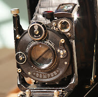
Here is proof that it is not only the processor in your digital camera, but the optics that shoot the image that make a difference in quality. Contessa Nettel Cocarette adapted an old film camera with a Zeiss lens to attach to her digital SLR. Thanks to Make magazine for the find.

Contessa Nettel Concarette with Carl Zeiss Tessar 105mm f/4.5

This is a 6x9 rollfilm camera made by Contessa Nettel (one of the companies which merged to form Zeiss Ikon in 1926). The lens is a Carl Zeiss Jena Tessar 105mm f/4.5, in a dial-set Compur shutter. The camera has rack focusing, meaning that the entire lens assembly moves for focusing. This gives higher image quality than front-element focusing, where only the front element of the lens is moved.

The camera's back doesn't open, but rather the film is first loaded onto an insert that slides into the camera. The back, however, has a small circular door for cleaning the back of the lens.

I removed the circular door from the back of the camera and glued a short (11mm) M42 extension tube in it's place. Now the entire camera can be attached to my DSLR with an M42 adapter, and pictures can be taken through the lens. Thanks to the rack focusing mechanism, infinity focus is possible by not fully extending the bellows. For close-up photography, the bellows work really well for macro extension.

In my initial test shots, the lens has proven to be very sharp.

Based on the serial number of the lens, this camera was probably made in 1923. Certainly before the Zeiss Ikon -merger in 1926.

Be sure to check out her crop comparison of the same image taken with and without the Zeiss adaptation.

Wednesday, March 28, 2007

Mighty Artist honored

Paul Kuhn, one of the artists on our For Sale Gallery, recently received an award for his work. Paul won 1st prize in the professional photography category at the 27th Annual Juried Members Exhibition held by the Sedona Arts Center. In addition to the photography category the competition also awarded prizes for sculpture, painting, ceramics and jewelry in 2 divisions, one for emerging artists and one for professional artists. Paul's winning piece (seen above) is titled Rocky Foursome and was taken at the San Francisco Peaks near Flagstaff. We produced Paul a canvas print with gallery wrap that he submitted for the exhibition. Our congratulations to Paul!

To see more of Paul's work, take a look at his gallery.

Tuesday, March 27, 2007

Creative is NOT a Department

For those of us that work in the photography or graphic design field you know how hard it can be to be "creative" all the time. Anthony Mikes has an article in the Spring issue of Southwest Graphics magazine that acknowledges how important it is to integrate everyone in the office to a imaginative mindset and offered some ideas to keep the creative juices flowing.

Creative is NOT a Department; by Anthony P. Mikes

Not long ago, I did an in-house seminar for a midsize agency. During a discussion of their core strengths, one of the account supervisors said to me that she felt the agency would be a lot better if the creative department could actually meet a deadline and bring forth more economical solutions to clients' problems. Just as I was about to answer, a thought occurred to me...as enlightened a thought as I've had in the past few years.

"Creative" is not a department. Creative is an agency way of life in the 21st century.....

How do you turn your department-oriented agency in to one big creative entity? It's easy. Just follow these steps.

1. Meet regularly to discuss the agency's work.....

2. As you develop your agency's mission and vision, make sure you include points about being a creative organization.....

8. Make your environment creative. What does it hurt to decorate the agency in a creative way? Colors, posters, banners, open space and collaborative areas all inspire your entire organization to be creative, not just the few people in the creative department.
The full article can be found at www.secondwindonline.com, but you have to register with them to read it.

Friday, March 23, 2007

Is it fine art if it is created in the computer?

Much like when photography first entered the art scene, digital art is now challenging many people's conception about the definition of fine art. This is a great write up from the people at We Make Money Not Art blog.

A conversation about exhibiting and selling digital fine art:
Reto and i stepped out of the gallery and wondered whether a space that focuses on digital art was viable. Does it follow the same economical model as any other gallery? Does it have a market? A future? [DAM] is a bit isolated in the art gallery landscape (at least in Europe as New York, for example, has Bitforms and the Bryce Wolkowitz Gallery) so how does it work? I then decide to contact Wolf Lieser, the gallery owner and curator, and asked him if he'd find some time to answer my questions. I'll never thank him enough for his enthusiasm, the way he supports and promotes digital artists and for reminding me that the discipline is already some 40 years old. Here's an overview of our conversation....


To check out some digital art from one of our Mighty Artist's take a look at Bonnie Mitchell's gallery.

Wednesday, March 21, 2007

Photo blog 100 years in the making

Shorpy.com has a collection of images taken by Lewis Wickes Hine that shows what life was like 100 years ago (before child labor laws). It is an interesting history lesson. Maybe you can show it to your kid the next time they complain about not having enough iTunes credit. Thanks to Make Magazine Blog for the find.

Shorpy.com is a photo blog about what life a hundred years ago was like: How people looked and what they did for a living, back when not having a job usually meant not eating. We’re starting with a collection of photographs taken in the early 1900s by Lewis Wickes Hine as part of a decade-long field survey for the National Child Labor Committee, which lobbied Congress to end the practice. One of his subjects, a young coal miner named Shorpy Higginbotham, is the site’s namesake.

Tuesday, March 20, 2007

Recent additions

We have added some new artists to our For Sale Gallery lately. Both offer distinctive and very different outlooks on the world around them.

Cyndi Stamm's work ranges from beautiful shots from her many travels to abstract studies of light and line. Her images looks fantastic on the Metallic paper. To see more of Cyndi's work check out her gallery.


Tim Roberts offers a perspective from thousands of feet in the air. Tim does a lot of his shooting from a helicopter as an aerial photographer. He has some unique shots of the South and Southwest taken from above. He also has some wonderful nature shots taken with both feet planted firmly on the ground. Check out Tim's gallery here.

Friday, March 16, 2007

With a little help from Adobe

Who needs scholarship money if you can score some from Adobe? If you know any stellar photography or design students give them the heads up.

The Adobe® Design Achievement Awards celebrate student achievement reflecting the powerful convergence of technology and the creative arts. The competition — which showcases individual and group projects created with industry-leading Adobe creative software — honors the most talented and promising student graphic designers, photographers, illustrators, animators, digital filmmakers, and computer artists from the world's top institutions of higher education.

International prestige and valuable prizes

The 2007 Adobe Design Achievement Awards competition is open to students at post-secondary institutions in 30 countries throughout the world. First-place winning entries will receive US$5,000, a trip to attend the awards ceremony, valuable Adobe software products, and studio tours.

Show off your talent and creativity. Submit your entry now.

Monday, March 12, 2007

Lost and found

Here is a inventive way to use big photos. Last December artist Beth Arnold posted these posters all over Melbourne of discarded objects to try to match them with their owner. Although the posters are down now, the idea and the website still live on. Check out the Discarded Object Poster Project site. Review by Guerrilla Innovation.

Have you ever seen a single shoe in the gutter, a beanie on the road, or a glove on the tram, and thought about whom the object may have belonged to, and how it got lost?

If yes, then you will love the Discarded Object Poster Project.

Discarded Object Poster Project is an urban artwork by Beth Arnold devoted to lonely deserted objects that we tend to notice, only to forget about them soon after.

The artist recently invited people in Melbourne to submit photographs of discarded objects along with information about their location. The images will then be made into high-quality posters and posted around the city.

Walking tours to view posters will take place at the opening on Thursday December 12th.

Friday, March 09, 2007

Need something to do this weekend?

It is that magical time of year here in Arizona. That brief window of time after the winter rain and before the blistering heat hits when the desert comes to life with beautiful blooms. It is fleating, so catch it while you can. Arizona Highways magazine has posted a list of places to visit if you are planning a weekend excursion.

Expanded Wildflower Guide: by Michael Famiglietti and JoBeth Jamison

The sun makes its summer approach as winter moitsture melts into the ground, finding its way south to feed the desert seeds of Arizona's wildflower display. Perhaps one of nature's most unpredictable arts, wildflower-watching can be fruitless as it can be fantastic....

Wednesday, March 07, 2007

Leave 'em hanging

Do you have a blank wall that could use a new look? Or maybe you just need to freshen up your current art arrangement. This article from HGTV can help you out, or give you some inspiration to try a new design.

Designing and Hanging an Art Collage
First, pull together items that have something in common. All-gold frames with black-and-white images would tie unlike subject matter together. Then, add a couple items with some dimension, like a gold wall sconce with a candle on it, or a gold framed mirror. Don't overdo the variety so that the common thread of the grouping is lost.

Once the items have been collected, start arranging them in a space equal to the space available on the wall, but working on the floor. It's very easy to move things around and get a feel for the overall effect when you can work in an open area on the floor.

Now, how does the collage get from floor to wall? Just grab a couple of brown paper grocery bags, a pencil and a pair of scissors...

Friday, March 02, 2007

Fun weekend read


We wind up printing a lot of aerial photography here because of the LightJet's amazing ability to image fine detail accurately. This 1920 publication by Herbert Eugene Ives entitled Airplane Photography shows you how far the industry has progressed. Check out the huge camera and mountings they would use on to a bi-wing plane. Not quite the same as a hanging out of a helicopter with a digital camera. Thanks to Make Magazine for the find.

Airplane photography - 1920's
Here's a great 400+ page book (free) for download from the 1920's on airplane photography - Airplane Photography - Google Book Search - Link.

Thursday, March 01, 2007

Photoshop goes web 2.0

Seems like there has been a lot of news coming out of Adobe recently. This one could be huge for the online photo editing market. Adobe has plans to offer a free (ad supported) online version of Photoshop in 6 months. Story by Martin LaMonica and Mike Ricciuti for CNET.

Adobe to take Photoshop online

...the hosted Photoshop service is set to be free and marketed as an entry-level version of Adobe's more sophisticated image-editing tools, including Photoshop and Photoshop Elements. Chizen (Bruce Chizen, Adobe CEO) envisions revenue from the Photoshop service coming from online advertising.

...Chizen said that although hosted Photoshop is meant to be a low-end product, the company intends to ensure that it is of a higher quality than free alternatives.