Monday, July 28, 2008

Printable privacy window films

LexJet recently introduced a new line of window films that can be used in all types of commercial and private home design applications. The film allows light to pass through, but the texture of the material provides privacy. They developed three distinct looks, from a three-dimensional stained glass look, to a pebbled matte texture, to rice paper, they have a look that will fit your decor.

LexJet Introduces Printable Décor & Privacy Window Films

The new SUV-compatible window film line includes Glacier, Velvet, and Rice Paper Window Films. Each film was specially-developed based on customer requests for a window imaging solution that can be used in a wide range of environments, from residential to high-end commercial, retail, and corporate décor.

"We used LexJet Rice Paper in a custom showcase home and it generated a great deal of interest from people touring the home," says Lance Licciardi, Licciardi Design, Sarasota, Fla. "I plan to use the printable privacy window films in future projects because they allow me to create a range of custom window effects without having to specify costly custom glass."

Contact us for more details if you are interested in using this unique material for your next project.

Friday, July 25, 2008

Using the power of 9 to create wall art


Sets of 3 image repeated or grouped together is a common theme in decorating and art. When you multiply that by 3 you get the power of 9. A set of 9 images can really make a big impact on a room. If you have a large wall and are unsure what to do to bring it to life, consider using this decorating rule to create an art installation that will accentuate your space and make a bold statement.

Using the Power of Nine to Decorate: Blissfully Domestic

Much has been said in the decorating world about the power of three. Repeating an element three times is very effective. I love three so much that I often find myself decorating in three to the third power. I love nine!

Why nine?

1. Today's homes often have vast amount of wall space.

Many of the homes constructed in the last 15 years have large walls. Often these walls extend up 1 1/2 to 2 stories. That is a lot of wall space. Placing a picture or a series of three pictures on a vast wall can dwarf the artwork or arrangement.

Tuesday, July 22, 2008

Underexposure correction

You can spend lots of time and money planning out your trip, but sometimes you just can't plan for the sun being behind the shot of the site you have been dying to visit. Making for an impossible lighting situation. A poorly exposed image can ruin what would be a picture perfect postcard shot. What can make it worse, is if the adjustments made in Photoshop to correct it are noticeable. Especially when making it in to a large print.

This tutorial posted by Sean Dugan on Layers magazine shows you how to correct your underexposed images with a combination of processing the raw file and Photoshop CS3. One very useful tip is where he shows you how to eliminate the halo or "blooming" you can get around the edge of an object where it meets the sky.

Photoshop CS3: Underexposure S.O.S.

Let’s face it, even though you should always try to get the best exposure in the camera so you don’t have to spend a lot of time fixing it in Photoshop, every once in a while you end up with a badly underexposed image. In this tutorial, we’ll focus on ways to improve a severely underexposed RAW file using both the controls in Adobe Camera Raw and Photoshop....

3 CHECK FOR ARTIFACTS AT 100% VIEW
Double-click the Zoom tool to zoom in to 100% and check for artifacts caused by the Fill Light adjustment. Use the Hand tool to scroll over to the far left side of the image. Dramatically lightening the image with Fill Light has produced an unnatural outline fringe around the temple roof. There’s also a noticeable purple coloration along the roof edges. This is called “blooming,” a digital capture phenomenon created by the overly bright sky behind the darker temple. The brightness of the sky pixels has “spilled over” onto the pixels of the roof edge. We’ll address the noise later.

Thursday, July 17, 2008

The Commons on Flickr

The Commons is a division of Flickr set up to share public domain archives with the world. They have partnered with archive powerhouses like the Library of Congress, the Brooklyn Museum, and the Smithsonian Institute to name a few.

The project was launched at the beginning of the year and has been wildly successful. Within 24 hours of their appearance, there had been 650,000 viewings of the images, and comments were added to more than 500 pictures. Some 4,000 unique tags were also added. It also lead to the discovery that negatives from Lincoln's inauguration had been previously mislabeled.


There are thousands of interesting images offered on the site. Like this image of Ty Cobb and Christy Mathewson at the 1911 World Series. Many of them large enough to make big prints if you wanted.

The key goals of The Commons on Flickr are to firstly show you hidden treasures in the world's public photography archives, and secondly to show how your input and knowledge can help make these collections even richer.

The program has two main objectives:
  1. To increase access to publicly-held photography collections, and
  2. To provide a way for the general public to contribute information and knowledge. (Then watch what happens when they do!)

Tuesday, July 15, 2008

Film is not dead

Just ask the members of Analog Photography Users Group, APUG for short. It is an online haven for photographers who did not want to make the switch to digital and still love to use photographic silver-based materials for their work. Discussions of digital cameras and inkjet printers are forbidden on the site unless they are in addition to traditional processes.

The site started by Sean Ross in 2002 is dedicated to maintaining the "art" of photography in its traditional form. They now have over 27,000 members, and have grown so much that Sean left his position at IBM to run the site full-time.

Perhaps, even more important than passing along their message of devotion to traditional photographic techniques, is the power of the Internet and the fact it has allowed this community of film lovers to revel in their passion together and spread the word - not every picture need be captured on a chip. - Picture Business Magazine

Thursday, July 10, 2008

Over in a second


Barbara Probst takes a unique approach to her photography. She shoots one location or studio set up simultaneously with up to 12 different cameras at a time. The resulting series of diptych and triptych images compares and contrasts what the "reality" of a photograph can tell us by combining completely different angles of the same scene. Each set or group is printed on a large scale to involve the viewer in each perspective of that split second in time.

Nicole Pasulka of The Morning News wrote a great interview with Barbara furthering exploring the concepts of her photographic process. Found Via.

Split Second

How do you set up these shots?

When I photograph there are always at least two and sometimes as many as 12 cameras involved. There is no way for me to look through the viewfinder during shooting, since all cameras release at the same time. Therefore, I have to set up the cameras and instruct the models very deliberately to get every camera to frame the scene in the right way. Needless to say, there is “accidentiality” involved, which I enjoy working with. The results are never quite as planned, but usually there’s something I can work with. I am not interested in manipulating images on the computer. My work is based on an investigation of the conditions of photography and its relationship to reality.

When I look at some of your work—like Exposure #35, for example—it doesn’t seem possible that the photos could be the same shot. Do you consider your diptychs or triptychs to be photographs of the same thing? What’s each panel’s relationship to the other or others?

The images of each series are always shot in exactly the same instant. Each series show at least two simultaneous views on one and the same thing from different angles, distances, and contexts. This simultaneity is essential to my work. The relationship of the images is based on it. The simultaneity makes the images comparable. The viewer gets involved in the work by shifting his or her view from image to image —back and forth—and by comparing the images and bundling up the different points of view the images are made from in his or her own point of view. This analytical way of looking leads to questions about perception and raises of doubts about our ability to recognize truth.

Monday, July 07, 2008

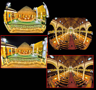
Correct barrel distortion with Fisheye-Hemi


Image Trends recently released their Fisheye-Hemi plug in for Aperture 2.1 (Apple's photo-editing software). The plug in helps you correct barrel distortion created when shooting with a fish eye lens. Mac users who would like to purchase the plug-in for both Photoshop and Aperture, or customers who already own the Photoshop plug in and would now like to add the Aperture plug-in, will receive a 50% discount on the second copy.

The plug in is also available for Windows users.

For more about Image Trends and another of their great products, PearlyWhites, you can read one of our earlier posts here.

Fisheye-Hemi is a set of plug-in filters for Photoshop, Photoshop plug-in compatible applications, and Apple Aperture which provide correction for hemispheric fisheye lens distortion.
Fisheye Hemispheric lenses in the hands of a photographer provide an expanded view of the world across approximately a 180 degree diagonal field. Until now, the primary option available to the photographer was to render these fisheye images using rectilinear mapping techniques. These methods have many drawbacks, such as distortion of people near the perimeter and loss of resolution and data. Although the image is similar to what is seen by the eye, printed, the images appear distorted.

Thursday, July 03, 2008

Tips for shooting fireworks

Tomorrow is July 4th. From coast to coast there will be fireworks displays to commemorate our nation's 232nd birthday. If you are planning on bringing your camera along with you to catch one of the shows, here are some great resources with tips on how to get the perfect fireworks shot.

Smithsonian Photographers (like Nicholas Parrella whose image is seen here) share their experiences and offer some technical notes on what lens and exposure settings they used to get their shots.

DPhoto Journal offers a check list of things needed to position yourself for the best shot.
1. You must arrive early

This is the first important thing to do if you want to get the best spot in the venue. It is even better if you spend some times to scout the location and have a little talk to the event crews to determine where the fireworks will be launched. Once you’ve got all the information needed, try to position yourself wisely. Find a clear, unobstructed view that meets your compositional requirements based on the terrain. Also try to find a place where people won’t be able to wondering around in front of the camera or worse kicking your tripod in the mid-exposure

TFC - The Fireworks Channel is all things fireworks. Not only for the 4th of July, but also New Year's Eve, carnivals, and celebrations all around the world. They also have their own list of tips on how to get the best shot.

Most of all enjoy yourself and have a safe and happy holiday!