NATIONAL GEOGRAPHIC ANNOUNCES SECOND ANNUAL INTERNATIONAL PHOTOGRAPHY CONTEST Official Press Release
National Geographic readers around the world have the opportunity to take part in the 2007 National Geographic International Photography Contest. And, for the first time, readers of National Geographic's English-language editions in the United States, Australia, New Zealand, Canada and United Kingdom will be able to participate in the contest that was inaugurated in 16 of its local-language editions in 2006.
Tuesday, July 31, 2007
Get published in National Geographic
This is a golden opportunity to have one of your images published in National Geographic magazine. They are holding a photo contest and the winners in 4 categories (people, landscape, animals, and photo essay) will win a digital SLR camera kit, and best of all, will be published in their magazine. The contest begins tomorrow, August 1st and ends October 31st. Review your portfolio for your best shots, and get them entered! For official rules check out this site.
Friday, July 27, 2007
Charles Brooks receives masters from Professional Photographers of America
We recently worked with Charles Brooks on 4 prints he submitted to the International Print Competition held by the Professional Photographers of America (PPA). If even one of them received high honors he would reach his ultimate goal of earning a Masters of Photography. So, we have been waiting with bated breath for the judges to tally their scores. We just heard today that not just one of his images was selected for exhibit, but all 4. Where Elves Play, the image seen here, was also accepted in to the 2007 PPA loan collection where it will go on a world tour. Way to go, Charles!
Thanks, Charles! We think you do too.
The results are in from the Professional Photographers of America International Print Competition, and I am a very happy cowboy!
I can't help but share this with you, because it means that I have now earned, after two years of work, my Masters of Photography through PPA. All four images were accepted for exhibit at the January 2008 PPA National Convention. One in particular, Where Elves Play, was accepted into the PPA 2007 Loan Collection which means that the PPA will publish the image, as well as, include it in their world tour exhibit next year as among the most outstanding images of the year from their membership. This is my fourth Loan Collection print since 2003.
A special thanks to Mighty Imaging who made these prints perfectly for the competition. They do extraordinary work!
Thanks, Charles! We think you do too.
Thursday, July 26, 2007
Typographics
This video put together by Ryan Uhrich and Marcos Ceravolo at the Vancouver Film School is a entertaining illustration on how typography is used in design. The placement of text is a key part of what makes an effective visual graphic. If done wrong, the impact and your emphasis are lost. It is a well done piece and good review whether you are a graphic designer, in advertising & marketing, or just watching for fun.
Labels:
advertising,
design,
graphic design,
marketing,
typography
Tuesday, July 24, 2007
Enlarge your photobooth strips
Remember cramming you and 4 of your friends in to a tiny photobooth making faces at the camera? Ahh memories. Well, it is not too late to recreate one of those days from your youth. Photobooth.net offers a comprehensive list of photobooths that still exist out there waiting for your best silly grin. I was pleased to see that there is one in Phoenix at The Trunk Space. They also offer resource on renting one for your wedding or a big event, like Ron Cowan did for these shots taken at his wedding. They also have listings of movies and TV shows that have used photobooths, books featuring the hazy vignetted shots (MTV's TRL has a great one if you want to see celebrities striking a pose), as well as artists that have utilized photobooths to create their work; most notably Andy Warhol.
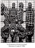
These little strips look amazing when blown up. You can make a large 10x50 panoramic print or cut it in to 2 up strips and place them side by side for a square print. If you are more in to the art side of it, you can montage several shots together for a surreal effect ala Herman Costa. If you have an old strip sitting in a drawer somewhere, making an enlargement of it for your fellow photobooth companions would make a great gift. All you need to do is scan the strip large enough to make the print size you are going for, or we can scan it for you.
Thanks to John Nack for the find. It brings back so many memories.
Labels:
art,
art history,
photo gift,
project idea
Wednesday, July 18, 2007
Tips for making your room look bigger
It is a topic that brings a lot of visitors to our blog... How to decorate a room so that it looks bigger? Many of the articles written by interior designers agree. Instead of cramming several smaller items in to an arrangement, use one large piece as your focal point on the wall. Freshome uses this and other suggestions on how to making the room look more spacious.
5 Tips for Fooling the Eye and Making a Room Look Bigger:
“In a small space, everything counts.” - That’s the main idea behind this article, and how we can make a small room look bigger, with some clever tricks.
Small rooms can feel confining and uncomfortable. Luckily we can utilize certain design concepts that fool the eye and make our rooms seem much bigger and spacious.
#4 Cut the Clutter
...Don’t cover your walls with a lot of pictures. One large painting [or photograph] works better than a group of small paintings. If there’s too much going on, all clamoring for attention, it can make the room feel busy and crowded. So, when decorating a small room, create a focal point, one area or feature that will draw the eye.
Monday, July 16, 2007
Another good reason to print your images
A couple weeks ago we talked about the importance of printing your images in our Wireless memories? post, so that later on in life when you wonder what happened in 2007 you have more than just a memory card to look at. Here is another excellent reason to print out your images; vanishing media and file formats. Right now jpegs, tiffs, CD's, DVD's, and the various media cards are the standard in saving your files. Can you be sure that it will be the same 20 years from now? Or even 5 years from now? Remember floppy disks and zip drives? Where as the a printed image will look just as good 20 (or even 100) years from now. This article talks about the problem as it relates to libraries and their constant struggle to keep up, but the photography industry is also learning the same painful lesson.
Warning of data ticking time bomb: BBC Technology News
The growing problem of accessing old digital file formats is a "ticking time bomb", the chief executive of the UK National Archives has warned.
Natalie Ceeney said society faced the possibility of "losing years of critical knowledge" because modern PCs could not always open old file formats.
...Ms Ceeney said: "If you put paper on shelves, it's pretty certain it is going to be there in a hundred years.
"If you stored something on a floppy disc just three or four years ago, you'd have a hard time finding a modern computer capable of opening it.
"Digital information is in fact inherently far more ephemeral than paper," warned Ms Ceeney.
Thursday, July 12, 2007
Personalized music poster
This would be a great gift idea for any music lover. Or just a cool way to make a personal statement using your favorite bands as the backdrop. We would be happy to print it, of course.
Make a huge printable poster from your iTunes album art!
This is a instructable describing how to cumbersomely export your existing iTunes album art and arrange all the covers into a huge grid, leaving you with a gigantic, colourful and vibrant mishmash of popular culture ready for printing and, maybe later, your wall!
I decided I wanted to do this a couple of nights ago and now I've come up with a method, it's not really complicated but can be rather time-consuming depending on how large your library is.
I have around 800 albums with attached album art and it took at least an hour, granted most of that time is spent watching your computer doing all the work for you.
The process requires you to download some free applications (links supplied) and you also need a new-ish version of Photoshop (I use CS3) although I'll show you an alternate way of getting basically the same results with Google's free digital photo organizer, Picasa2.
Labels:
decorating,
photo gift,
photoshop technique,
project idea
Tuesday, July 10, 2007
You can't keep me in a box
That is Kerry Randolph's moto. Kerry is a digital artist, and after looking at his work you will see what he means. Kerry recently joined the group of artists offering work on our For Sale Gallery. His work is unique to say the least. They are almost like looking in to an alternate universe. To see Kerry's work visit his gallery. Kerry has many more images than we could fit on his gallery, to see his entire portfolio you can visit his Flickr page. All of them are available for purchase.
Kerry Randolph does some of the most amazing Digital artwork that I have ever seen. His imagination is endless, and he astounds me each and every time I view his work. His use of color, form, texture and sense of movement are incredible. I can never wait to see what he’ll come up with next. Each piece of his art is complex and takes a long time to absorb. When you really look at his work, small details pop out that you don’t see at first.
Monday, July 09, 2007
Paint like a master
In Photoshop that is. Or you could use Illustrator, InDesign or GoLive for that matter. Dr. Woohoo, a New Mexico based artist and designer, has built a pretty amazing website called In The Mod. There he has deconstructed several different master works by well known artists to their most basic element; color. You can download the color palette of your favorite artist directly in to Photoshop or Illustrator as a .ASE file and build your own masterpiece. Or perhaps you were so inspired by Cezanne's painting of Mont Sainte-Victoire that you want to decorate your room in the same colors. Well, you can download the palette here. There are also tools that will connect the similarities in color palettes between the painting you are viewing and all the other paintings in their large database. Some fun stuff to play around with or good place to find inspiration for your next design project.
Labels:
art,
color theory,
design,
photoshop,
project idea,
technology
Friday, July 06, 2007
Wireless memories?
Scott from Visualville posed a question that I have been wondering for years. Where have all the pictures gone? With more and more people converting their entire lives to digital, the absence of real printed pictures is creating a large gap in our tangible history.
There was a time when photos, (prints), were precious. A fireman once told me that normal folks will only run back into a burning building for one of the three P's... People, Pets and Pictures. Could you lay your hands on 100 meaningful printed images from your life? I doubt if I could. We are making more and more digital images and fewer and fewer prints. Where have all the photographs gone? Will we have our memories as we grow older?Would you run back into a burning building for your memory card? I think not.
Tuesday, July 03, 2007
Fly away
We have just added some amazing nature photography to our For Sale Gallery courtesy of Richard Simonsen. He has dedicated hours on end to capture some stunning close up shots of loons and other birds. Since tomorrow is Independence Day, I thought his shot of an eagle was particularly appropriate. Richard also has some images of the Blue Angels and other scenic shots from his travels around the country. To see all of Richard's work visit his gallery.
Richard’s images of the Minnesota State Bird, the Common Loon, come from immersing himself in the life of one family of loons over two summers in the Boundary Waters Canoe Area Wilderness of northern Minnesota. His photograph of the underwater loon made in the fall of 1997 is a classic image of one of nature’s best underwater hunters.
Subscribe to:
Posts (Atom)