Friday, June 29, 2007

Step up

Creating any wall arrangement can be a quite a project. Adding an angle on top of it makes it even more of a challenge. Better Home and Gardens has some great tips on how to make a knock out photo gallery for your stairway. Taping up paper templates first to confirm your arrangement can save your walls from unnecessary holes.

Tips for Creating a Stairway Photo Gallery:

Think of a place in your house that you and your family pass by several times each day. That is the perfect place for family photos: Everyone in the household will have the opportunity to enjoy the montage as they move through the space.

...Before hanging pictures, consider the lighting. If the stairs are dark, add overhead spotlights on a track. That will not only improve the view, it will make the stairs safer.

A montage like the one shown here allows a lot of flexibility. Pictures from different times, in a variety of sizes, and in various frames can work together because of their family ties. Yet you'll get a more cohesive look by keeping the mat and frame colors in a similar range.

Thursday, June 28, 2007

Blink of an eye

How would you like a camera that could totally eliminate red eye and even better not need any flash at all? Kodak is working on that. They are developing a sensor that will read not only the color but also the brightness of what you are shooting. The new technology will be implemented in cameras they release in 2008.

Kodak's New Sensor May Eliminate Flash: Dory Devlin for Yahoo Tech

Here's how it would work: The new technology would increase light sensitivity of existing image sensors by two to four times. That means a camera's shutter speed could increase, which would reduce camera shake and blurring problems. If it works, it also would allow photographers to shoot in low light without producing grainy, speckled photos.

The proof is in the pixels. In most digital cameras, each sensor pixel detects either the color red, green, or blue and places them into a pattern named for Bryce Bayer, the Kodak engineer who developed it. With the new high-sensitivity technology, half of the pixels will be panchromatic, or clear, so they will capture only the brightness, not color. That means a 12-megapixel camera would have 6 million panchromatic pixels, 3 million green pixels, 1.5 million red pixels, and 1.5 million blue pixels. In comparison, today's 12-megapixel cameras have 6 million green pixels, 3 million red, and 3 million blue.

Monday, June 25, 2007

Streets of New York

If you are located in the Southwest then right now, like me, you are searching for activities to beat the heat and potential boredom of the summers here. Spending a day gazing at photography in the comfortable climate controlled environment in the Phoenix Art Museum fits the bill nicely. In their own words, "Cool art. In a cool place." Since their renovation earlier this year the PAM has been showcasing work on loan from the Center for Creative Photography in Tucson. Their current exhibition entitled On the Street: The New York School of Photographers will run until September 2, 2007 and features work from such greats as Diane Arbus, Garry Winogrand, and the infamous Weegee.
Photographic pioneers honed their craft on the streets of New York: Richard Nilsen for the Arizona Republic

In the 1930s, new technology transformed photography.

The introduction of the Leica and Contax cameras that used 35mm film meant that photographers no longer had to lug around enough equipment to sink a small boat. These handheld cameras - then known as "miniature cameras" - gave their users mobility, anonymity and speed. And it put them out on the street.

The new genre, usually just called "street photography," changed the way we looked at photographs.

In Europe, the Leica freed Henri Cartier-Bresson and André Kertész. In America, it gave the Farm Security Administration photographers, including Russell Lee, Ben Shahn and John Vachon, a lightness and agility that gives their photographs a sense of life caught on the fly that the more formal work of, say, Walker Evans - who used the old large-format cameras - could ever have with his equipment pinned to the top of a tripod.

The 35mm camera put the photographer in the immediacy of the moment.

But it is the urban streets, and especially those of New York, that gave the genre its classic look. It was in New York that the "grab shot" on the street became almost gospel. New York is a city just waiting for its close-up.

Thursday, June 21, 2007

Next stop 50 miles


If you ever needed a good reason to go to a rest stop, besides the obvious one, this is it. William Wegman recently installed large photographic murals of his infamous weimaraners in two rest stops in Maine. A third to be installed in 2008. The five paneled piece entitled "Flock" is shown above.

Renowned photographer unveils mural at rest stop: Kristen Andresen for Bangor Daily News

Photographic murals, each approximately 5 feet tall by 35 feet wide, were installed earlier this week in the northbound and southbound plazas in Kennebunk. A third will be on view in a West Gardiner plaza, which is slated to open in 2008.

A panel of art experts and transportation officials selected Wegman's submissions from a pool of 50 artists. His international stature, ties to Maine and the accessible nature of his work set Wegman apart, McNeil said. So, too, did his willingness to work within the group's $100,000 budget, which is far less than a comparable work would fetch on the open market.

"I think we're getting a lot for our money," McNeil said.

Tuesday, June 19, 2007

Are you ready for your close up?

This week Kodak announced a new line of consumer cameras that are due to come out between now and September. Looks can be deceiving, these small cameras pack a powerful punch. The M753 & M853 models will capture images that are large enough to print 30x40's. Plus they come in pretty colors. Full write up by Digital Photography Review.

Kodak Brings Style within Reach with New M-Series Zoom Digital Cameras

The KODAK EASYSHARE M753 and M853 Zoom Digital Cameras are equipped with 3x optical zoom lenses and 7- and 8-megapixel resolution respectively, which allows consumers to print clear, crisp images up to 30” x 40” in size.

Friday, June 15, 2007

Take the plunge


What a great way to make your own expandable lighting or backdrop set up! There are simple to follow step by step instructions posted on DIYphotography.net. The site is also full of countless other project ideas and tips.

Super easy hardware store light-backdrop stand:

Tim Boesenkool has sent this awesome idea on how you can make a DIY backdrop stand that reaches all the way to the ceiling, without getting in a fight with your wife.

I have two sturdy light stands but with the work I'm doing it isn't really enough, and I'm tired of propping reflectors on wobbly chairs etc. Because I don't have excess room I need something with small footprint as well.

So cruising around the hardware store I discovered a great cheap, no assembly required solution and I have two stands for under 50 bucks.

Thursday, June 14, 2007

Digital dentistry


Go ahead show those pearly whites. Or maybe they're not so white, well you can fix that. If only it were this easy in real life without spending hours in the dentist chair. Image Trends recently released two new Photoshop plug-ins that will automatically whiten teeth and remove skin glare. Two very common problems in portrait photography. Full write up by CNET.

Cheaper than a dentist: Photoshop teeth-whitening filter

The company's PearlyWhites and ShineOff plug-ins cost $49.95 each. The plug-ins work on Windows, but Mac OS X versions will be available later.

The filters can operate in a batch mode, allowing Photoshop users to edit large groups of images in bulk. The PearlyWhites plug-in doesn't need to be told where teeth are located--the often-laborious selection process. Instead, it applies its changes to white areas that it finds surrounded by flesh tones, said Michael Conley, vice president of marketing and sales.


Monday, June 11, 2007

Shades of Grey

Looking for a new decor theme that will impress? Why not try black and white photography? It made an impression on Sara Denning who wrote the article below. She leads by describing a home that made such an impact on her that it inspired her to write the article.
Black and White Art on Your Wall: by Sara Denning

Add drama and sophistication to your home! Years ago I attended a party that took place in a Deco style stucco house that I will never forget. It represented the height of sophistication from that period of decorating style. As I entered the front door, I was struck with the low lit interior and the boldly striped wall paper. The living room was all beige with white accents. The dining room walls were terracotta and a classic Greek keystone pattern ran around the bottom of glossy black crown molding. Throughout the house were at least a dozen black and white photos of architectural buildings and etchings. Obviously I was impressed. Any moment Humphrey Bogart and Lauren Bacall could have walked through the door!

You might not be ready for something quite this dramatic. However, the look of black and white art on a wall can make a highly sophisticated statement. When you are shopping for black and white images, keep in mind the main elements that viewers notice are line and mass. You can select highly distinctive pieces with bold lines and large mass shapes. Many images will have grey tones throughout and these will help soften the overall look.

The size of the image will determine the level of intrigue that the viewer experiences. For example, a series of small images will invite closer inspection and a single large image will increase the power of the subject.

We have several artist in our For Sale Gallery that feature black and white work; Ray Lusson, Mark Culbertson, Art Holeman, Kevin Dyer, Christine Taft, and Reflections Photography (who's image is displayed above) just to name a few. All of them are reasonably priced and ready to add to your new look.

Friday, June 08, 2007

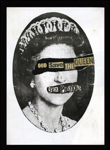
God Save the Queen

The Sex Pistols' song that helped spur the punk rock revolution of the late 70's serves as inspiration for an art show Panic Attacks! at the Barbican Art Gallery in London. They are will be displaying work from Cindy Sherman, Robert Mapplethorpe, and Peter Hujar just to name a few. Whether you are a fan of the music or not it is hard to dispute the impact the movement had on culture and art.

BBC News has a slide show that features a sampling of the pieces at the show. It made me want to see more, but alas, a trip across the pond is not in my immediate future.

Panic Attacks! will run until September 9th.

Thursday, June 07, 2007

Larger than life


These images by Mark Robbins were printed life size for his 2003 installation at the Atlanta Center for Contemporary Art creating a powerful impact on the viewer. I particularly like his choice of placement and juxt a position. The subject is set along side their environment almost as you would set a plant in the corner of a room. The people have no higher level of importance in the piece than how they choose to arrange their furniture.

Model Homes: The Photography of Mark Robbins by Julie Lasky for the Design Observer

Mark Robbins' Households is a collection of portraits in which the sitters are sometimes sitting rooms (or kitchens or bedrooms) and the people are polished, draped, and arrayed like furniture. Composed to resemble architectural plans or elevations - or in some cases the triptychs of medieval altarpieces - the images represent home dwellers and their environments.

...Slim margins separate the people from their interiors, building facades, urban settings, and one another - even when they are shown side by side.

Is that discreet white border a margin of privacy? A form of containment? A strip of mortar gluing together the bricks that form an establishment? By atomizing and rebuilding his pictorial edifices, Robbins deconstructs the identities and relationships they represent.

Wednesday, June 06, 2007

Milestone

"2007 will mark the first time that more prints will be made from digital than analog (film) sources."
-DIMA

We still get a fair amount of film that customers need scanned for printing. A well exposed medium format or 4x5 piece of film still beats out digital in detail for large prints, but we are definitely seeing less and less of it.