Wednesday, May 30, 2007

Coming to the surface

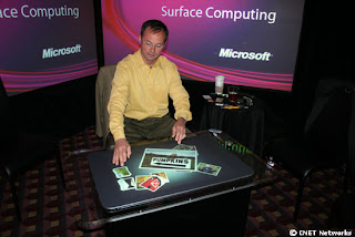
Microsoft released their newest innovation in computer technology today. Their Milan surface table top computer is run entirely on touch manipulation. There is no mouse and no keyboard. It looks very similar to what Jeff Hahn demonstrated at the TED convention earlier this year. Read our write up on it here. The implications for the creative market are endless with a tool like this, but without a keyboard how do you blog?

Microsoft hopes 'Milan' table PC has magic touch: by Ina Fried for CNET News

At first glance, Microsoft's secret project looks like a 2007 version of the sit-down arcade game Ms. Pac Man.

But if this machine were running the game, you could just take your finger and flick away the monsters chasing the heroine.

Microsoft on Wednesday is taking the wraps off "Milan," five years in the making and the first in what the company hopes will be a long line of "surface computers." The Microsoft Surface tabletop PC, for which the company has created both the hardware and software, offers shades of the technology seen in the sci-fi thriller Minority Report. The whole unit is controlled entirely through touch; there's no mouse or keyboard.

To paint, people can pick up a paint brush or just dip their fingers in virtual paint cups. Sharing photos is similarly intuitive. A stack of pictures can be easily sorted through and shared. To resize a photo, just stretch two fingers apart. Pivot the fingers and the image rotates. More than one person can be interacting with the computer at a time.

Friday, May 25, 2007

Another mighty artists joins our gallery

We are so blessed to be able to work with such talented artists. We have added another photographer to our For Sale Gallery; Colleen Miniuk-Sperry. Colleen left her corporate job in February of this year to pursue her passion for photography. She has been published in Arizona Highways magazine. If you take a look at her gallery of images you will see why, it is some really amazing work.

To purchase one of Colleen's images check out her gallery.

Thursday, May 24, 2007

This is not a photograph


You may think your eyes are deceiving you, but this is not a photograph. It was not done in Photoshop either. It is some pretty amazing airbrush work by Dru Blair. It took 70 hours to paint. Even in the close up of the image it is nearly impossible to differentiate it from the real thing. Thanks to Don for the find!

Painting of Tica by Dru Blair:

This is a painting completed in February 2005. It was a Portrait Class project that I decided to finish in my spare time after the workshop. It probably took a total of around 65-75 hours to complete. The small images are step by step photographs taken during the painting process, and the large image is the final painting after detail and skin texture are added with an eraser and colored pencil. The main colors are blocked in at the beginning, but refinement is withheld until the very end.

Monday, May 21, 2007

Rare early color photography

These autochromes were recently re-discovered and will be on display for a limited time this October at the George Eastman House in Rochester New York. Autochrome processing was an early form of color photography that utilized color dyed potato starch that would transfer the image on to the photo-sensitive glass plate creating a positive image. This is the story of how they were re-discovered and came in to the museum's possession.

A Splash of Photo History Comes to Light: by Randy Kennedy for The New York Times

At first glance the two pictures seem to be gorgeous anachronisms, full-color blasts from the black-and-white world of 1908, the year Ford introduced the Model T and Theodore Roosevelt was nearing the end of his second term.

But they are genuine products of their time, rare ones, among the few surviving masterpieces from the earliest days of color photography, made using a process developed by the Lumière brothers in France and imported to the United States by the photographer Edward Steichen a century ago this year. They were taken by Steichen, probably in Buffalo, and are thought to be portraits of Charlotte Spaulding, a friend and student who became his luminous subject for the portraits, which resemble pointillist miniatures on glass.

Friday, May 18, 2007

Digital photography as wallpaper

What a great way to jazz up a room! This one is designed for a child's bedroom and they wisely finished it with latex to prevent any crayon or other kid related additions to the artwork. Why not use a similar idea for a master bedroom? You could cover one wall with a serene nature scene and wake up every morning in your favorite locale. The right image it could be a fantastic accent wall in a living room or dining room as well.

He also has an excellent way to solve the low resolution problem when trying to take digital files larger than they are meant to go. He changed it to a vector file using Illustrator CS2. Thanks to Lifehacker for the find!

Geekdad: Large Format Printing as Wallpaper

Last year, we decided to redecorate our kids’ rooms. We stumbled across the idea of “large format digital printing” while researching ideas for wall coverings. It seems print houses have discovered another use for the large format: turning photographs into wallpaper for your home. Dizzy with ideas for a photo-based wall, we decided to create some custom wallpaper for my son’s room.

... He and I love to watch Formula One together, so we decided to use some photos I had taken the last time I attended the U.S. Grand Prix. A little Photoshop work made the image more interesting, but I had a problem. Even using a plugin to blow up the photo, it was only half of the resolution I needed to fill the whole wall. The solution was found in Illustrator’s Live Trace feature (links to .pdf). With a little finesse, the photo was transformed into a scalable vector file.

Tuesday, May 15, 2007

Images that pop out at you

If you are a fan of DIY then Instructables is the place for you. They have thousands of tutorials. Everything from how to build a home made lava lamp to hand made alternatives to photo equipment. They also have some pretty cool Photoshop tutorials. This one shows you how to add a 3D effect to your images.

Creating a 3D effect with image editing software:

Here's how to make a neat effect to make it look like the subject of a photo is popping out of the background. This can be done with GIMP (GNU Image Manipulation Program) or Photoshop.

step 1 Get a good base photo
A good base photo will have a prominent subject with strong lines, strong perspective, and an uncluttered background. You should also use as high a resolution image as possible.

This image doesn't have super strong perspective, but if you look at my other images, you'll see that an image with strong perspective works best.

Friday, May 11, 2007

Art for sale!

We have added another artist to our For Sale Gallery. Ray Lusson is an Arizona native who decided to flee the heat of the desert for cooler climates. (Since it was 102 here yesterday, I can't say I blame him.) He now runs his own gallery in Depoe Bay, Oregon. One of Ray's reoccurring themes is something we don't see a lot of here in the desert; water. His tag line says it all: “Arizona Desert Rat Gone Coastal and Has the Photos to Prove It.”

To see Ray's work visit his gallery.

Wednesday, May 09, 2007

First Trillion-Pixel Image

This is some pretty amazing technology. I bet this image has enough information to wallpaper your house. Hope you like pink.
First 1 trillion-pixel image; by Donald Bell for CNET

Medical imaging specialists Aperio have broken the 4GB file size limit on the TIFF image format by creating their own format called BigTIFF and offering the format into the public domain (an amazing fact in its own right). To showcase the power of BigTIFF image resolution, Aperio has released the first terapixel image. The image shows 225 pathology slides of breast tissue and can be viewed and explored online (it looks surprisingly like a pink version of Google Earth once you start zooming in).

The image's actual file size as a compressed BigTIFF is 143GB, so don't expect to be shooting terapixel photos on your digital camera anytime soon. To make this kind of resolution useful, Aperio had to use a high-power oil immersion ScanScope slide-scanning system to get the necessary detail.

(via Medgadget)

Tuesday, May 08, 2007

Art Appreciation

More specifically photography. It is good to see that photography has been getting more attention lately in Phoenix. Richard Nilsen wrote a multi-part piece for the Arizona Republic in conjunction with the opening of Latent Image, a show starting this Friday running through August at the Mesa Art Center. It is really a fascinating article that covers many aspects of the industry from its beginnings, the key players, to what technology has added to the art form . Although there is too much information to post here, it is worth investing the time to read it for yourself. Here is a teaser...
Art that Clicks; Richard Nilsen for the Arizona Republic

The best photographs do the same thing as the best paintings or sculptures: They vivify our sense of being alive and bring us into contact with the world we often pay too little attention to. They act as caffeine for our senses, our thought and our emotions.

That's more than a snapshot attempts.

"What is the difference? Why are my snapshots not art?" asks Douglas Nickel, director of the Center for Creative Photography in Tucson, one of the world's best institutions for the collection and study of photographs.

On the gallery wall, you see a landscape by Ansel Adams or a still life by Edward Weston or a portrait by Richard Avedon. They carry something beyond the charge that wallet photos of your family has.

"Sometimes someone can come up with a really great picture," Nickel said of the amateur, "but their meanings are private - they mean something to them and the people around them. Art photography is meant as public statement. Art has a public function. It is meant to make a more universal statement about the condition of the world."

Like all art.

Because of photography's popular image, the gallery and museum world was slow in accepting it as art. Most museums didn't include photography in their exhibition schedules until a century after its invention, and color photography had to wait until the 1980s to be taken seriously.

When photographer Alfred Stieglitz tried to interest the nation's museums in photography in the early years of the past century, he initially got no takers.

"Photography can't be an art," he was told over and over, "because it's made by a machine."

Odd. You could say the same thing about a piano.

Finally, in 1924, the Boston Museum of Fine Art accepted Stieglitz's collection - grudgingly.

Times have changed: In 2005, a single photograph made by Stieglitz sold at auction for $1.4 million.

Friday, May 04, 2007

Continued Education

I found this post on Design Observer, a site dedicated to writing about design and culture. The post by Michael Bierut is a reprint of Michael McDonough's list of the Top Ten Things They Never Taught Me in Design School. Although Michael McDonough is an architect, his ideas translate to any design/creative profession. He observations are very astute. It is worth reading the whole thing, but I especially like #9.

Michael McDonough's Top Ten Things They Never Taught Me in Design School:

1. Talent is one-third of the success equation.
Talent is important in any profession, but it is no guarantee of success. Hard work and luck are equally important. Hard work means self-discipline and sacrifice. Luck means, among other things, access to power, whether it is social contacts or money or timing. In fact, if you are not very talented, you can still succeed by emphasizing the other two. If you think I am wrong, just look around.

6. Don't forget your goal.
Definition of a fanatic: Someone who redoubles his effort after forgetting his goal. Students and young designers often approach a problem with insight and brilliance, and subsequently let it slip away in confusion, fear and wasted effort. They forget their goals, and make up new ones as they go along. Original thought is a kind of gift from the gods. Artists know this. "Hold the moment," they say. "Honor it." Get your idea down on a slip of paper and tape it up in front of you.

9. It all comes down to output.
No matter how cool your computer rendering is, no matter how brilliant your essay is, no matter how fabulous your whatever is, if you can't output it, distribute it, and make it known, it basically doesn't exist. Orient yourself to output. Schedule output. Output, output, output. Show Me The Output.

Thursday, May 03, 2007

Graffiti your walls

Curbly is a very active community site where you can post pictures and ideas on DIY projects, get inspiration and advise from other creative people, designers, and the like. If you have not visited it yet, you should. That is where I found this great idea for using graffiti to decorate your home wall space. By selecting close up sections you can abstract the colors and textures that will compliment your decor.

Graffitti Artists Work = Contributers to My Home's Art:

I'm on a budget. My home is important to me. Art is important to me. When you throw these things together, walk into my apartment, and check out whats hanging on the walls, you see the results of artwork on a budget. Most of the pieces are my own work. I wish I didn't have to resort to my hanging so much of my own work, but dang it's easy on the budget.

One day I realized that I could use someone else's graffitti as sweet color-infused art in my home. I grabbed my digital camera and shot about 45 pictures of the least offensive (although if offensive grabs you, by all means, go with it) graffitti I could find. I then printed some of my favorites, put them in affordable frames, and organized them in coordinated groupings. It's cheap, not labor intensive, and happens to be a fun scavenger hunt activity.