Wednesday, September 27, 2006

Large Photographs Celebrate Labor Leaders

New Haven Independent: Labor Heroes Live On At Stetson: "Indeed, in a letter next to the proposal, Madalengoitia wrote, “I look to represent the ethnicity and culture of the people who live in the area, as well as include prominent figures, local landscape, and the history of the area.”
Acting Branch Manager and Youth Librarian Diane Brown-Petteway drew attention to another piece, a photographic mural by Susan Bowlen. The mural is a skillful compilation of photographs of the labor movement from the 1960s and '70s."

Simplicity


Sometimes we find ourselves in a creative slump. And we wonder what could we shoot that would be interesting. Well, this photographer shot leaves... on black background. Stunning. Imagine them big (we love big images). Imagine them really big. On metallic paper. Stunning work. (Website has that unfortunate scrolling nav thing, but after a while you can start to work with it). Check out these stunning images.

Stephen Farley's Favorite Places Project


Tucson designer and visual artist Stephen Farley has created quite an interesting display with huge black and white images on tiles. We love big images, and this is a very cool project.
Stephen Farley's Favorite Places Project: "Farley is committed to the sharing of personal stories among the broader community, and has consequently been involved in teaching art, design and computer skills to young people of diverse backgrounds while collaboratively producing a series of publications exploring the social and personal histories of local neighborhoods. In 1999 he founded a nonprofit called Voices: Community Stories Past & Present, which runs afterschool programs which employ at-risk youth to interview Tucson residents and publish books and magazines of community stories and photographs."

Tuesday, September 26, 2006

Honorable mention

One of our favorite clients that we don't get to talk about much is Dino Tonn. He does beautiful interior and exterior architectural photography for some of the leading home builders, developers, architects, interior designers and public relations firms. Since his work is directly commissioned by these companies on an per project bases we are unable to feature him in our for sale photo gallery. We do have the pleasure of printing any enlargements needed for his projects. If you are ever looking for a photographer to make your home or business look like it is ready for the cover of Architectural Digest give Dino a call.

Monday, September 25, 2006

Worldwide Pinhole Photography Day

I found out about this about 6 months too late to participate this year. Looking at their gallery of images made me want to dust off my old pinhole camera for next April. Definitely worth a look. Of course, any of those images would look great as a big print.

The last Worldwide Pinhole Photography Day was celebrated around the planet on April 30, 2006. Visit the gallery to view the pinhole photographs taken on that day from participants around the world! Worldwide Pinhole Photography Day - home

Loose 10 lbs without diet pills

If CBS can do it for Katie Couric, why can't the rest of us get a little appearance boost?
They say cameras add ten pounds, but HP digital cameras can help reverse that effect. The slimming feature, available on select HP digital camera models, is a subtle effect that can instantly trim off pounds from the subjects in your photos! trumpets HP about the seven models that offer the feature. Among them are the HP Photosmart R967 and the HP Photosmart R927, which Robin wrote about in this lineup of digital cameras. Cameras Tinker With Reality : Dory Devlin : Yahoo! Tech

Saturday, September 23, 2006

Architecture Saturday... Think Big

The Mighty Imaging crew loves cool architecture, and especially cool architectural photography. When we found this list of architectural photographers in Europe, we just had to share it with you.
Guido Erbring, Germany
Eduardo Hahn, Italy

Photoarch, Italy


Ying Yi, Singapore


Vassills Markos, Greece

John Mills, Australia

Harris Associates, Leeds

Floto + Warner, New York
(Yeah, it isn't Europe, but neither was the Australia guy,)


Friday, September 22, 2006

Decorating with Portraiture

What ever happened to the big 16x20 or larger framed family portrait pieces that you would see above the fireplace or behind the couch of most people's homes? You know, the ones where everyone is wearing matching outfits and smiling and happy (even the 2 year old). Now the creative photographer has moved beyond the traditional studio setting to doing environmental portraits as well. Matching outfits are still preferred. I came across this website by Ilene Olson of Natures Photography that makes some valid points about using portrait photography to decorate your home.

Any art form possesses the capacity to touch our emotions. Portrait images carry with them an additional dimension of expression that communicates how we feel about ourselves, our world, and those closest to us. Portrait subject matter and settings are limited only by imagination...children as they grow, family times or events, expressive personal statements. All are appropriate for decorative portraiture.

Key Points to Remember

- The portrait's overall color theme should blend with or complement the room's color palette.
- Keep in mind the decorative intent of the room in which you plan to display your portrait when you consider its style. This will help to set the portrait's tone and guide you in selecting appropriate clothing, accessories, and setting.
- An appropriately sized portrait is one that dominates the space in which it is hung, but does not appear to be crowding the space. Be sure to establish whether the space lends itself better to vertical or horizontal composition.
- Framing provides "the finishing touch" to fine portraiture. Select a frame that compliments the image and accents the room's furnishings, not one that distracts from the subject matter.
- Whether your portrait is an accessory or the room's focal point, placement is critical. All elements of design - color, style, composition, and size - must work together to complete the decorative statement.

So come on everyone, put on some black turtle necks and let's make a memory!

Wednesday, September 20, 2006

160 megapixels...

Holy Cow! You can only put two images on a two GIG card. And you are gonna need one of Scott's monster machines to work with it. But.... ooooh... can you imagine the possibilities.
Seitz 6x17 Digital shoots at 160 megapixels - Engadget: "When we first spotted this new cam from Seitz, our jaws hit the floor and rebounded a few times. No, it's not the highest megapixel count we've seen, but this megalith of a camera shoots at 160 megapixels to create a native 6 x 17-cm image, is packed with an ISO range from 500 to 10,000, a read-out speed of 300MB per second, and a shutter speed of 1/20,000th second. So the next question is, how are you going to store such huge image files (nearly 1 GB per uncompressed full panorama), certainly not on your off-the-shelf 16GB SDHC card, nor the upcoming 64GB CompactFlash cards -- but rather via gigabit Ethernet to Seitz's 'state-of-the-art computer system', which translates to a decked out Mac mini."

When it comes to marketing, don't be color blind

I think we all know by now that color can effect your mood. Which can also effect your buying decisions. The people at Color Matters have accumulated massive amounts of data concerning how we perceive color and its impact on our daily lives. Take advantage of their research to help you improve the power of recognition and persuasion in your promotional signage.

1. Research conducted by the secretariat of the Seoul International Color Expo 2004 documented the following relationships between color and marketing:

92.6 percent said that they put most importance on visual factors when purchasing products. Only 5.6 percent said that the physical feel via the sense of touch was most important. Hearing and smell each drew 0.9 percent.

When asked to approximate the importance of color when buying products, 84.7 percent of the total respondents think that color accounts for more than half among the various factors important for choosing products. Source

2. Research reveals people make a subconscious judgment about a person, environment, or product within 90 seconds of initial viewing and that between 62% and 90% of that assessment is based on color alone.
Source: CCICOLOR - Institute for Color Research

3. Research by the Henley Centre suggests 73% of purchasing decisions are now made in-store. Consequently, catching the shopper's eye and conveying information effectively are critical to successful sales.

Our mission is to produce the most vibrant and colorful images possible to help you achieve your marketing goals.

Monday, September 18, 2006

Scott has been documenting some of his heroes

Follow along with Scott at Visualville.com as he gives us some personal insight to some of the greatest photographers ever. You may be intrigued by the incredible talent shown here.
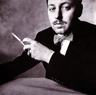
Visualville: A Photographers Resource: Irving Penn - My Heroes Cont.: "This image of a rather nattily attired gentleman with a cigarette holder is a portrait of Tennessee Williams by Irving Penn. One of my favorite authors photographed by one of my favorite photographers, it doesn't get any better that that."

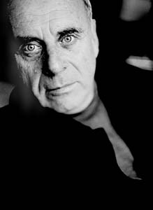
Nice Interview with Timothy White


Timothy White: Action. Reaction. Motion. Emotion. - Features | ImagingInfo.com:
: "Clients pick up on the team's unspoken communication and the confidence the team exudes. White mentions being 'reactive'—as opposed to 'proactive'—several times during our discussion. It's fundamental to his shooting style, as well as his personal style. 'While I have some ideas in mind before a shoot, I walk in ready to react to the client's mood, react to a change in light, react to serendipity. Over styling doesn't interest me. I'm interested in images you can't tell if I shot 10 years ago or today.'"

Using Large Images to Build Brand

This is a great little article form "Studio Photography" on how using very large images to build an awareness campaign. Read the whole thing.
Marketing Section IV - Features | ImagingInfo.com:: "After seeing the success of these displays, we revamped the displays in several of the jewelry stores we work with. Morgan Jewelers and Schubach Jewelers have left it up to us as to what images work best. All the display images in these stores are 40x60 or larger. Prospective brides call us all the time now about these jewelry store displays. To make it a win-win situation with our vendors, we give each of them $50 to $100 gift certificates that they can give to their selected customers to redeem at our studio.

This year, we started working with a local bridal shop, a women’s clinic, and The Buckle, a popular teen clothing store. We photograph our upcoming senior reps in Buckle clothing and have a DVD slideshow playing in their front window. Clark and Rachel Martin gave us the idea of working with The Buckle and showing a DVD slideshow.

We’ve learned five display musts: (1) To stand out, you need to be out in front of your potential clients; (2) images must command the display space they take up; (3) we have to keep the images fresh by changing them two to three times a year; (4) we need a common link in all our advertising that brands us and always links the client back to us; and (5) we have to make it a win-win for our studio and our vendors."

Saturday, September 16, 2006

The Sahara... Huge, Wide, Beautiful


Declan McCullagh photographs the Sahara

Micheal Palin takes us inside the Sahara with some unusual photographs and insights.

In "River of Sand," photographer Jean-Luc Manaud and writer Martine Ravache capture the beauty and mystery of the Niger River as it wanders through an otherwise dry and lonely place.

Our PhotoGallery features select photographs from "River of Sand," a book of Mr. Manaud's photographs of life on the Niger River.

Photos of Morocco. Fascinating.

The giant sand dunes at Merzouga herald the start of the Sahara Desert. Expatriate American author Paul Bowles wrote of the desert ...
"... there is a hushed quality in the air, as if the quiet were a constant force which,
resenting the intrusion of sound, minimises and disperses it straightaway".

Large photos of the desert, especially one as expansive and exotic as the Sahara, can give a room a sense of space and simplicity.

Friday, September 15, 2006

Mashing Up' on your own site (at Don's)

Here's a cool little movie that will show you how to mash up FilmLoop and your website / blog.
it's what I do...: 'Mashing Up' on your own site: "I have created a little movie that shows you how easy it is to create a FilmLoop,, and then how easy it is to post to your site, blog or whatever. This little thing has been very, very successful for me. I encourage you to add it to your arsenal. The PHOTOtool, FilmLoop, Slide and Flickr... and a few others that I will share later, keep my work out there."

More than just a pretty picture

I have been reading a lot lately about a broader usage of photography in home decor. Whether it is because it is an affordable option to decorate your house for a quicker resale in a slowing market or because it just looks so darn good on the wall. This article expresses exactly what I am talking about.
More than just a pretty picture - photography tapped as home-decorating element: It's time to stop stuffing snapshots into an old shoe box. Same for grouping those 5-by-7 class pictures in standard-issue gold frames on the piano top. Photography has come into its own as a home-decorating element. Decorating with photographs is artistic and often more affordable than other more traditional art forms.

Lorna Fenenbock, who owns The Art Barn in Ossining, has worked with many customers who want something more powerful than a memento for the mantel.

They might create a collage or a shadow box. Sometimes they just want an unusual matting or a particularly eye-catching frame.

They go on to say...

Joseph Squillante of Mount Vernon, a photographer since 1972, agrees. "I would certainly say photography is in a very good place today," he says. "Photography is still affordable as a fine-art medium."

I think I know where you can find some great affordable fine-art photography to fit with your decor.


Wednesday, September 13, 2006

We love big images... and big lenses too!

... well of course it is only for Hasselblads, but come on, you want one don't you?
Carl Zeiss creates telephoto lens with 1700mm focal length - Engadget: "it sounds like it was custom-built for a client who wanted to shoot wildlife at a distance on the very high-end Hasselblad 203 FE using 6 x 6 medium format film -- in other words, she/he has some serious cash to spend. No word on if it will be ever made available to the public, but it sounds like Carl Zeiss is open to ideas if you've got a briefcase full of euros to pay for the project, not to mention the means to get it from wherever you are to wherever you actually want to use it without scaring every living thing in your path."

Article: "To 'Res' or not to 'Res'


Certainly most of us have decided at one point or another that we wanted a big print. Should we 'res it up' in Photoshop or another image manipulations software, or let the lab do it?

The answer may depend on the lab, the processing equipment or other considerations, but labs who use a RIP software sure can save you a lot of time. Taking a 24MB image up to 400MB can take quite a while.

Mighty Imaging shows a side by side comparison of an image that was res'd up in Fractals and the file as it was RIP'd on their Lightjet.

I use a RIP on my Epson 7600, and we have tested it by printing the same image three ways: res'd in Photoshop, res'd in Fractals and left at original capture and then RIP'd to the output size. The RIP'd image actually ended up as sharp, and with a bit more pleasant contrast than the other 2 ways. (Yes, we did the Photoshop at the 10% increment method... time intensive, but it does the best job.)
Mighty Imaging: Large Format Printing for Photographers, Corporate and Design Applications: "Some of our photographers prefer to 'res up' their images in Photoshop or Fractals. This results in a huge file, and that is certainly OK with us, but there may be another, simpler way. By using our RIP processor Mighty Imaging can take your image from the capture size to mural size with very little difference in the final image from the 'res'd up' file. This saves file size, allows for faster electronic transfer and saves the photographer lots of time. In addition, the photographer has to only keep one file at the original capture size."

Tuesday, September 12, 2006

Diego Ceja: Landscapes


Diego Ceja is one of our new photographers on Mighty Imaging's gallery site. Take a look at Diego's work. Stunning landscapes, ethereal spaces in nature, and a kind of 'fragmented' view of details.
"He holds a degree in Earth and Planetary Science from Washington University in St. Louis. It was while doing research on the salt domes in Utah that he became aware of the spiritual beauty of the desert. He was a wedding photographer and then a product and commercial photographer but returned to his calling as a fine art landscape photographer."

Mighty Artist receives national recognition

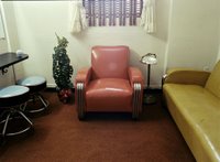
Judith Faust's image Moose Lodge Ladie's Room (scene on the right) was recently accepted in to a national competition organized by the Texas Photographic Society. The show opened at their Dougherty Art Center in Austin, Texas on September 1st. Congratulations Judith!

For more information on their events:
Texas Photographic Society Calendar

To purchase or view any of Judith's fantastic work go here.

Sunday, September 10, 2006

Risking death...

or at least a severe cold... photographers will do what it takes to make images this stunning. You absolutely must check Chromasia's Photo Blog as often as possible.
c h r o m a s i a / photoblog / wyre wreck #9
We checked the tide times on Paul's web-enabled phone, and confirmed that high tide was 11.36pm. So, almost high tide, but we were getting our feet wet. We decided to climb aboard one of the boats I'd photographed before – wyre wreck #5 – and wait until the tide receded. We took a few shots and noticed that the tide was still rising – it was now about a foot deep around the boat. We pondered for a while, and it got deeper. At this point it was beginning to look as though we were stuck on the boat for a while.

Friday, September 08, 2006

Interview: Ralph Gibson


One of he icons of fine art photography, Ralph Gibson shares his insight and vision. Well worth a read.
Ralph Gibson: "Chris/Larry: Let us begin with a question about your vision. Your work has an extraordinary balance in it, a certain kind of energy to it. Can you tell us about your state of mind when you are shooting?

Ralph: Well, for the longest time I have known that photography for me is not directly linked to an external event. For example if I say that tomorrow there’s going to be an execution at 12 o’clock. You get there, we can all win a Pulitzer prize. If you get there at 12:01 you miss your shot, as it were. So, what I wanted to do, is be able to make my perception of anything become the subject itself. And for this reason I’ve attempted to take pictures of simple things, you know, like a cardboard box, or a chair, or a spoon. Very humble objects. I’m not terribly drawn towards the epic event. I’d like to make something totally insignificant into an object of importance, by virtue of how photography works."

Thursday, September 07, 2006

Get a bigger room without using a sledgehammer


I came across this article that gave some great ideas on how to decorate a small room to make it feel...well, roomier.

4) Cover an entire wall with a large poster, print or photograph and then pull your sofa away from the wall (see picture above). This creates the illusion of higher ceilings and allows for some breathing space.
Little Big Room - House Beautiful

Tuesday, September 05, 2006

Lovin' that Pinhole Photography


A great list of Pinhole Photography books including reviews. If you enjoy this laid-back approach to images, take a look at this fairly comprehensive listing of books you will like.
Product Listing - Books: "Included in the 'how-to' chapters are directions on how to make and use pinhole cameras, explanations on avoiding the most common mistakes, calculating exposure times, charts and formulas for optimal pinhole diameters, making and measuring pinholes, filtering, various camera designs including wide angle, 1:1, telephoto, multiple pinhole, digital pinhole, and extensive information on how to use zone plates. Includes lengthy chapters on the history of pinhole in both art and science, pinhole's renaissance from the 1960s to 2004. Many contemporary images are shown throughout the book. Includes new chapters on camera obscuras and digital pinhole. This book is a must for anyone interested in pinhole photography!"

Sunday, September 03, 2006

For Labor Day

A look at cities, the working man*, and some really cool images.
Sleepy City is photographically deconstructing the urban environment. Underground tunnels, derelict industrial sites and urban ruins are where I like to play. Discarded by society, these forgotten nooks and crannies wait quietly for the occasional urban explorer. Grab a torch and have a wander; you might be surprised how little of your city you have ever appreciated.
Here's a nice little site with some very cool black and white images. Urban photography at it's best.
I have photographed the urban environment for over twenty years. Emanating from my interest in sociology and history, I am fascinated by the ways cities are organized and by the stories the buildings and the streets tell. People are rarely seen in the photographs but their presence is certainly felt. Recently I have begun to photograph rural settings in addition to my ongoing urban photography. While these environments different from the city, I am drawn to the same graphic elements and to the stories contained therein.
I have Nitsa's book, "Streets of New York" and like it a lot. I bought a copy of it over at Cafe Press really to see the quality of the printing. I have been more impressed by LuLu for self-publishing photography books, but that is for another post.
Simply put street photography includes any photograph made anywhere in public places. Some people narrow it down to urban settings and some people think there must be people present in these kinds of photos. But the bottom line is that each street photographer will find their own meaning and approach therefore whatever definition they might arrive at will work just as well.
Then there is the wonderful work over at "Deviant Art." Pretty interesting.
THE URBAN PHOTOGRAPHY JOURNAL

The group of Deviant Art which is dedicated to the wonderful art and beauty of the city, and urban photography!
This is a very rich site of images, forums and resources. UrbanPhotos.org

Finally, enjoy the work of Gavin George. Shooting the urban landscape with lots of love for the subject.

Friday, September 01, 2006

Travel Guides: for Free

If you are planning a trip, you know, where you go somewhere and shoot images that will be printed really large at your favorite lab, you can use this cool site to download travel guides. Planning your road trip just got a little easier.