David Spindel is a photographer who has had some amazing opportunities in his career. He has worked with many celebrities, probably the one that has given him the most notoriety is John Lennon. He was given remarkable access to John at his recording studio in New York not long before his untimely death. David's work has been used for multiple album and book covers. We had the opportunity to print some of his images for shows he has had around the world.
David and his wife moved to Arizona 2004 to "retire", although I don't think he has slowed down much. He currently has a showing of his work at The Broadway Palm Dinner Theater in Mesa, Arizona until the end of May. He was also recently interviewed by the Arizona Republic and the Phoenix Magazine. This morning he was interviewed by Scott Pasmore of Channel 3 for their Good Morning Arizona show. If you missed it, here is a link for the interview.
In David's words "My favorite expression is that it has only taken me 50 years to be an overnight success."
Tuesday, May 26, 2009
Wednesday, May 20, 2009
Framing that is environmentally friendly
We have had the privilege to use Larson-Juhl frame molding as part of an order fulfillment program for one of our national clients. It is good to know that not only does Larson-Juhl provide superior looking frames, but also that they care about their environmental impact in harvesting the wood to make their product.
Larson-Juhl Receives Two Environmental Certifications
Larson-Juhl has been awarded chain-of-custody environmental certifications for moulding and matboard products from two worldwide organizations, Programme for the Endorsement of Forest Certification (PEFC) and Forest Stewardship Council (FSC). The Biltmore™ Frame Collection by Larson-Juhl® is PEFC certified and The Artique Biltmore™ Collection of Solid Color Core matboards is FSC certified.
...Third party independent auditors oversee harvesting through manufacturing, distribution, and sales to ensure that a product is certified as claimed and validate a chain-of-custody certification. Products that achieve certification can feature the logo and unique certification number designated to the company to prove validation.
Monday, May 18, 2009
Use wallpaper to make your room look bigger
Much like fashion, interior design trends tend to go in cycles. Many designers are re-discovering the possibilities with wallpaper. It can be used as an accent wall or, as described in this article, use a vertical pattern to help lift and visually make a small room look larger. With the UV Curable printing process on our Arizona 350 GT, not only is the printing process environmentally friendly, but designers also have an opportunity to create and implement a one of a kind custom design.
Wallpaper gives small space character: by Christine Brun
Sometimes a room needs more than just a coat of paint, especially if it is a room that serves a distinct purpose.
It is exactly in smaller spaces such as an entryway or a powder room that we feel most comfortable experimenting with new things. If the result isn't quite what we imagined, it is easier and less expensive to correct.
Other times, however, the emphasis you seek is for an area of greater impact, such as a living-room wall just begging to be treated as a focal point. Maybe you want to do more than just paint it a different color. Fortunately for the wallpaper industry, after what seems like a long drought, many people are turning to wall coverings to achieve that pizzazz.
...The photo shows wallpaper designed by Candice Olsen, host of "Devine Design" on HGTV. The soothing color and subtle vertical-print pattern help "lift" the ceiling height in the room, a good strategy for smaller rooms in general.
Labels:
design,
digital wallpaper,
interior design,
project idea,
wallpaper
Friday, May 15, 2009
Getting color right - all the time
Today's display graphics are no longer considered just a sign. Very often the graphics we print for our customers in the Retail Market are thought of as art by their shoppers.
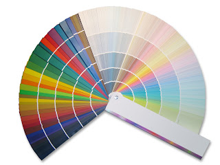
Here at Artisan Colour, color management is religion! The two pillars that we live by are accuracy and consistency. Our ability to replicate colors to the highest standard is a daily task. So often Retail Graphics Buyers demand that product colors in the graphics match the merchandise. Easier said than done, eh? A number of our readers have expressed frustration when trying to produce a certain color to match a brand or product where the slightest shift spells disaster. In the print graphics field we spell disaster W-A-S-T-E!
The other pillar of color management is consistency. Have you ever had a job come in where the client is requesting different applications for the same campaign? Using multiple printers on different substrates can seem like an insurmountable task when the goal is to be consistent through out the entire campaign.
In this month's edition of Wide-Format Imaging Marc Welch describes how science has aided color management in image editing and producing uniform and precise color output no matter what devise is used.
How it's Done
The workflow is quite simple:
The first step shuts off color management on all RIPs. The RIPs will receive color-managed files, so they do not need to perform this function. However, the RIP still performs basic printer to media calibration for each media type. This involves printing a tone scale for each color, and making adjustments to optimize the match between requested and printed values. Once calibration is complete, the device is linearized.
The final step is creating a reference or “fingerprint” of the printer or press. A reference chart is printed and ‘read’ with a spectrophotometer. This allows the software to understand both what colors your printer can reproduce as well as how it produces them. Good color management software takes the printer color output, compares it to a preferred standard (GRACoL, for example) and creates a link to correlate the printer’s color capabilities to the color standard. Printers with a broader range of colors (gamut) support a better match to the color standard or original color being matched.
With the right software and training, you can deal with special circumstances. For example, some customers print the backside of polycarbonate then laminated over the print with a white film. The resulting color gamut is considerably smaller than GRACoL. In this type of case it is possible to compress the input color range to fit the available gamut.
....What once required a time-consuming, difficult to teach, and often inconsistent skill has become an efficient, productive process. Both you and your customers will take notice.
Friday, May 08, 2009
Need inspiration? Get Ignited!
Well the temperature has broken 100 degrees for three straight days and that can only mean that summer has arrived in the Valley of the Sun. So, between the economy and the weather, it's not easy for creative folks like us to get inspired.
Since we're spending gobs of time trying social media as a way to drum up some business we here at Artisan Colour / Display Graphics have found a cool site where creative minds can present ideas. You know that many times it just takes a thought or an idea from someone to ignite the passion within. The site we found is appropriately named Ignite-Phoenix.com.
Ignite Phoenix is an information exchange aimed at fostering and inspiring Phoenix's creative community. On Tuesday, June 16th. Ignite Phoenix will be having it's fourth event at the Tempe Center for the Arts. While that event is more than a month away these folks are opening up submissions for the event right now. so get fired up and ignite the creative passions from within.
We are excited to announce that Ignite Phoenix will be returning to the gorgeous Tempe Center for the Arts for our fourth event on Tuesday, June 16th. The overwhelming turnout for Ignite #3 in February forced us to alter our plans, as we needed a venue that could hold 400+ people. Thanks to support from the City of Tempe and some generous sponsors, we will be in the TCA’s gorgeous 600 seat theater!
Ignite Phoenix has come a long way since the the first “I Wonder If Anyone Will Show Up” event last August, and from now on our goal is have the next Ignite scheduled and posted as soon as a previous event wraps up. We will also open up submissions immediately, so you can submit an idea any time it strikes you. The only time submissions will be closed will be during the judging period right before an event.If you have an idea you would like to submit for Ignite Phoenix #4, just visit our Submission Page.
Thursday, May 07, 2009
Help Rick D'Elia, and in turn help the children of Uganda
Rick D'Elia is donating his time to a very worthy cause by documenting the day to day struggle of survival in Uganda. Rick is trying to head up a trip that will benefit 4 charitable organizations by allowing them to use his images as part of their education and fund raising efforts. What Rick needs is help to raise the funds to make his trip to Uganda possible. I will let Rick tell the story.
STREEETCH and help some kids.
Help three small organizations that focus on education and other necessities mostly for kids in Uganda keep their programs running.
Let me explain.
As it is, small orgs must use whatever resources they have available not only in keeping the lights on but in trying to draw donations from a diminishing pool of donors in a increasingly competitive arena.
They draw donor attention through their communications tools, websites and mailers. Powerful photographs help make those tools successful. If the photographs are compelling, they convey the importance and strength of an organization. They motivate donors.
Small organizations, however, often can’t afford to bring an experienced, skilled photographer to their site. Their photographs are taken by staff-members whose expertise lies in education and social work. Those staffers are not trained in finding telling and emotional moments that make powerful photographs from which a viewer cannot look away.
Many of these organizations wish they could have work done by a pro.
With a little help, a little funding, a pro could be put into place without cost to an organization.
Wouldn’t it be even better if there were three or four organizations in the same area in Uganda with a similar need, the photographer is already in place to help out not just one, but several organizations accomplish the same goal?
Three for the price of one?
Just by pure coincidence (!?) atleast four organizations have expressed excitement at the prospect of getting great photographs of and for their programs:
Teach a Child to Fish http://www.teachachildtofish.org
Bega Kwa Bega (Shoulder to Shoulder) http://begakwabegaugandaorphans.org
Uganda Community School Project, Nawantale http://www.nawantale.org
Kirabo http://www.kirabocanada.ca
My plan is to spend about two weeks photographing these projects as a volunteer, as well as another five or six days of post production time. Travel expenses for two weeks, which would include, transportation, food and lodging, etc., will range between $3,000 and $3,600 depending upon the cost of the airfare. Departure depends upon how quickly these expenses are raised.
Teach a Child to Fish, will collect the funds, so, just fill out a check, and send with one of those “forever stamps” (remember the price is going up very soon) to:
Teach A Child to Fish
P.O. Box 491
Downers Grove, IL 60515
Enter in the notations, "NGO photo project."
TCF is 501(c)3 so, donations are deductible.
Once the expenses are covered, the rest of the donated funds will help TCF with their program.
Labels:
charitable effort,
charity,
photography,
photojournalism,
Uganda
Subscribe to:
Posts (Atom)