Tuesday, October 31, 2006
Monday, October 30, 2006
Still need help?
Here is another resource if you are in need of some Photoshop help. Why not go straight to the source? There are hundreds of tutorials on Adobe's website. The search options make it easy to find an article to help you out of a bind or give you inspiration to try something new. They are for CS2, but still very interesting to review even if you haven't upgraded yet. They have everything from little videos on how to correct barrel distortion to step by step instructions on how to make a digital file look like a lithograph (which would look great on the LightJet BTW).
Sunday, October 29, 2006
Strobist: Photography's Vanishing Middle Class
No matter where you fall on this question, after reading all the thoughtful and well formed comments, you will have a ton of stuff to think about in relation to photography, business and images in general. Fascinating... grab a cup-'o-joe cause it's a long read.
Strobist: Photography's Vanishing Middle Class: "As a staff shooter for a metro daily paper, I am lucky enough to make a comfortable, if not stellar, income doing what I love. But as I look around, I see that my ranks are thinning fast. And the long-term prospects for my profession do not look very promising for those who are entering it today.
About a month ago I got an e-mail from a friend of mine, John Strohsacker. He's a Baltimore-based lacrosse photographer who happens to have a background in business.
We had several e-mail exchanges and talked both on the phone and at various assignments. The gist of these conversations were pretty much John noting that he liked the Strobist site, but didn't like the idea of my giving the information away for free."
Saturday, October 28, 2006
Excellent Resource for Photographers
You will find lots of good information on this site. What a great little resource.
Ask your Adobe Photoshop questions, and I, Debbie Grossman, imaging guru and picture editor extraordinaire, will answer the best of them here.
Send queries to deardebbie@popphoto.com, and check out the About page for more info.
Friday, October 27, 2006
A pot of gold at the end of the rainbow...
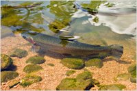
Rainbow trout that is. We recently did an amazing image on metallic paper for Leon Ritchie. The colors really lent themselves to the metallic media. It looked like the fish could practically leap out of the water. Leon decided to enter it in the Arizona Game and Fish 2007 Calendar photo contest where he took 1st place in the fish category. Look for Leon's image in next year's Arizona Wildlife calendar. Our congrats, Leon!
Thursday, October 26, 2006
Strobist: Free and So Easy: DIY Grid Spots for Your Flash
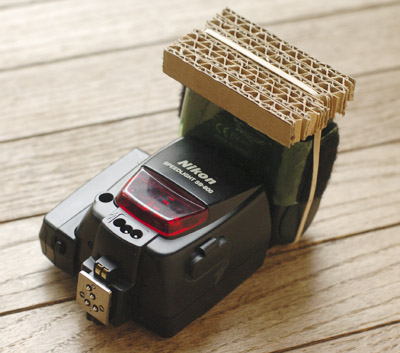 This is a handy little idea that can transform a problem shoot into a creative solution. Think about three of four of these placed at strategic locations... cool.
Strobist: Free and So Easy: DIY Grid Spots for Your Flash: "It sat on my list of (about 20,000) things to do until I saw a piece of thick, corrugated cardboard yesterday. Making these little grid spots really could not be easier. (Heck, the top picture pretty much explains it.) And can be done with things you are likely to already have around the house."
Wednesday, October 25, 2006
Expand your visual vocabulary
The folks at Elf Design have a great article called The 9 Advantages to Using a Visual Vocabulary in Brand Identity Design. It has some great points that anyone who is developing a new ad campaign for their company should consider. Here's a sampling.
The elements of your visual vocabulary become a graphic language, which takes your viewer deeper into your graphics and materials....
Graphics in a visual vocabulary are a method of communication that's more quickly understood than text alone. A viewer can absorb the meanings of colors, symbols, photos, shapes and even font types much more quickly than by reading text. So, in cases where time is of the essence—when you're marketing to busy people, creating motion graphics such as animations or commercials or designing items that people will quickly pass by, such as car graphics or billboards, this is an important consideration.
The right combination of visual vocabulary elements can also make your materials more eye-catching. When your materials are in competition with others—in a stack of proposals, on a table with other brochures or even a postcard coming out of a crowded mailbox—they'll have a better chance of getting noticed when they are designed with stunning and unique visual vocabulary elements.
Forty percent of viewers better remember visual elements. A visual vocabulary will increase the memorability of your materials as well, since people will have more visual elements to remember in your materials.
Monday, October 23, 2006
The birth of Photoshop
This is an interesting read about the founders of Adobe; Chuck Beschke and John Warnock. Where would photography be today without Photoshop?
How Adobe launched a revolution It's hard to believe that just 25 years ago, most people couldn't print out documents from their personal computers -- in fact, hardly anyone owned a personal computer.
``They changed the world of communication,'' said Bruce Chizen, Adobe chief executive. ``They made it possible for anybody to publish information. It went from one-to-many to many-to-many overnight.''
Sunday, October 22, 2006
Ok... you need to see this page...
Free Photoshop Plugins. Over one hundred eleven of them (111). It is a wonderful resource and they make it easy to see which will work with your platform (mac or win), and what versions of Photoshop they are compatible with. And remember, some of these plugins have multiple filters and such. A great resource. Thanks 111 Free Photoshop Plugins guys.
Saturday, October 21, 2006
Download of the weekend
This is a cool little app that may come in handy. Think of it as Photoshop lite... really, really lite. Gotta tell you though, it is very powerful and at a price point of free, well... kind of amazing too.
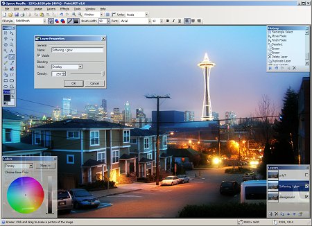

Paint.NET is image and photo manipulation software designed to be used on computers that run Windows. It supports layers, unlimited undo, special effects, and a wide variety of useful and powerful tools.
It started development as an undergraduate college senior design project mentored by Microsoft, and is currently being maintained by some of the alumni that originally worked on it. Originally intended as a free replacement for the MS Paint software that comes with Windows, it has grown into a powerful yet simple tool for photo and image editing.
Friday, October 20, 2006
Cool Image by "conceptDawg"

Occasionally we find a cool image that we want to share with you all. This is a very interesting effect. Check out the rest of his photostream while you visit.
Good reading
Wednesday, October 18, 2006
Artful design ideas
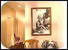 This article has some creative ideas on new ways to use and rearrange wall art images for a unique effect.
Decorating : Tips / Hints : Artful Design : Home Pull favorite photos tucked away in shoe boxes or photo albums out and have poster-size copies made. Older black and white photos that have been enlarged take on a grainy quality (much like an old film reel), which is part of the appeal
Monday, October 16, 2006
Put on your walking shoes
For those of you who live here you know that it has been much too hot until recently to even think about going out and walking around for enjoyment. Since it has finally cooled off here in the Valley of the Sun, we are able to re-emerge from our air conditioned caves for the kickoff of the fall art season. On October 19th from 7-9 PM the Scottsdale ArtWalk will feature Western artists and art. Take a walk and enjoy some art!
Friday, October 13, 2006
Diego Ceja and Mighty Imaging
We had an interesting situation at Mighty Imaging that we would like to share with you all. Diego Ceja, one of our gallery photographers was preparing for a show that was coming up this weekend. A wastepaper full of failed inkjets and trouble with his trusty printer had driven him to decide to print on the LightJet. He came in with about 20 images and we printed them out overnight.
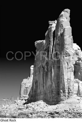
Diego walked in to the office and we laid the prints out. He stared at them. Diego is a very, very picky photographer and only accepts excellence... in his images and his prints. "Can I expect this every time I bring images in," he asked. We weren't sure if he was happy or not, but we felt they were great images and we had made them to the best of our abilities.
"Yes", Stephanie said. Diego turned and walked out. We were a little shocked. He returned in a few minutes with more disks. "Print all of these, please.. and can I have them for the show tomorrow?"
We did, and he picked them up this morning on the way to the show. He was thrilled.
Don caught up with him as he was ending up the first day of the show and got this quick interview.
We asked him how the Lightjets compare to the Inkjets that he normally does?
"Compared to the inkjet... wow... man. the metallic paper and the Flex paper are just awesome. It looks like IlfoChrome, and I have always loved IlfoChrome. And at the price they charge, wow... that is what I will continue to do. I will be moving over to the Flex with everything but the toned prints that I work and rework on the InkJet."
For his very large images, 40x60 and longer, he will continue with the deckle edge rag prints that he prints on his inkjet. "I have the profiles down and the watercolor paper is what the images are designed for. And adding the ragged edge makes it fit what my clients want."
Diego Ceja is a fine art lanscape photographer. He stives for a striking, clean and simple look at the complexity of the natural world. "There is nothing in the image that isn't there by design. I am working the image to fit what I want to say and sometimes I come back with no exposures. If the image isn't working, I don't bother to shoot it."
Diego shoots a large format, 4x5 camera that he lugs into strange and alluring places. "It's heavy and windy days are always a problem," he laughs, "but the image is so precise... and I love it."
About working with Mighty Imaging he says, "They have bcome my printer now for all my color work. Reasonable prices and customer service that is heroic. Stephanie really takes good care of all the customers, going the extra mile to make sure things go right."
See more of Diego's work in our galleries. We think you will like them as much as we do.
ProtectMyPhotos - Digital Photo Backup

This is a very nice, handy tool. Prices are very good and the protection is comforting.
ProtectMyPhotos - Digital Photo Backup: "ProtectMyPhotos shields your digital photos from hard drive crashes, viruses, file corruption, destroyed backups, fire, flood, theft, and more. Eliminate the need for CD backups, and rest easy knowing that all of your treasured photos are truly safe!"More at "It's What I Do"...
Workspace inspiration
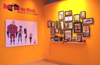 Even if you are looking at the clock right now calculating how many seconds until you can start your weekend, this compilation of 10 seeeeeriously cool workplaces put together by The Chief Happiness Officer may inspire you to remodel your office so that you'll never want to leave.
What I noticed through out most of the offices featured is their use of large prints in their space to bring more color and energy in to the rooms as well as illustrate past and future projects for that company. I also particularly liked Pixar's idea to use cottages with addresses instead of cubicles with name plates.
Thursday, October 12, 2006
How to Create Professional HDR Images

Now this is a pretty cool technique that should give some interesting effects> And doing these things in hi-res means you can make the prints big. Really big.
Backing Winds: How to Create Professional HDR Images: "I've come to believe that there are few things in the digital photography world that Photoshop can't do better than most other programs. HDR turns out to be one of them. Photoshop CS2 has a little-known (it seems) built-in HDR assembler that, while lacking the 'make my photo look like an acid-trip' tone-mapping features of Photomatix, is capable of creating extremely realistic or extremely surreal HDR images."
The camera is art
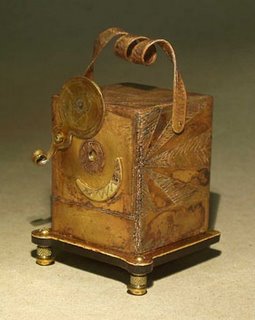
This beautiful pinhole camera caught my eye today. The camera itself is a piece of art. Judith Hoffman of San Mateo, CA built it. It is gorgeous design even if the handle is 'just for looks'.
A brass pinhole camera. 3.5 inches high, 2.25 inches wide. In the tradition of camera manufacturing, the handle is useless. If you lift the camera with it, the bottom falls off and your film is exposed. It's a camera to photograph memories. On the base the instructions read: 1. Fix memory in your mind. 2. Point Memocam toward memory. 3. Expose film. You can see an earlier stage of the camera and photos taken by it here. More information on my blog.
Wednesday, October 11, 2006
How Big Can I Print This Photo? — A Simple Answer, Once and for All
Monday, October 09, 2006
Have You Seen the Talent...
...in our gallery? Amazing photographs from some fantastic photographers. Come on over, take a look and enjoy.
Ansel Adams hits the road
I was very excited when I read this in Sunday's Arizona Republic. This is a rare and unique opportunity for photography lovers.
Phoenix Art Museum to show prized UA photosThe first show is features Ansel Adams work of the 1930's and opens on November 11th at the Phoenix Art Museum. They have added a gallery dedicated to photography as part of their recent $41 million expansion. Be sure to mark you calendar.
Photography buffs will get to see more masterworks of the medium at the Phoenix Art Museum thanks to an innovative partnership with the University of Arizona's Center for Creative Photography.
The collaboration, announced last week, includes a year-round exhibition program in Phoenix drawn from the world-class photography collection in Tucson. Co-founded by Ansel Adams in 1975 to archive all his negatives, work prints and notes, the UA center is now home to 80,000 original works by Richard Avedon, Edward Weston Harry Callahan and other artists.
Friday, October 06, 2006
Vector graphics in a raster world
 While most of the images that we print are prepared in raster programs like Photoshop, the LightJet also does an amazing job on files prepared in Illustrator and Quark.
We recently printed a job for Wendell Burnette Architects that they had prepared in Illustrator. They had 30x30's printed and mounted on gatorboard for a presentation to a potential client. Everyone was blown away by the quality. The colors were vibrant and all of the graphics and text were sharp with smooth lines. It was certainly a true representation of their talent.
For the best results from files prepared in vector based programs save them as an eps. A flattened tiff will work great too.
A Good, If Rather Simplistic Article on Protecting Your Digital Images
Here at Mighty Imaging we use several ways to protect our photographers images while they are online in the gallery. First, we watermark them visually. This is a simple, effective way to protect the art. We try to make it unobtrusive as possible. Secondly, we use the PHOTOtool to host the galleries. The PHOTOtool uses several ways to prevent easily saving the images, but in the end some technical folks can hack into the browser and pull them from cache. However, by doing that they are admitting to taking the images illegally.
10/3/06 Protecting your digital images from theft - CNET Community Newsletter: Q&A Forums: "There are a number of ways to digitally sign the artwork you produce and numerous software apps that will allow you to do this.
First, you could watermark your image, this is where you put a mark somewhere on the image (usually in the background), so that if anyone tries to pinch it from your site, you'll be able to prove that it did originate from you. To watermark something, you could do anything that will make your work obviously yours, and you can have it either obvious or hidden."
Thursday, October 05, 2006
I got a charge out ot this article.
(OK, I am so sorry for that headline ;-) Seriously, here are some interesting ideas for taking care of your batteries.
Getting Great Battery Life: "This isn't about how to get a lot of shots per charge. That's easy: use your LCD as little as possible and spend as little time as possible in the menus or with the meter on. Turn the LCD review OFF while shooting. Easy.
This is how to get years of great service from expensive batteries. Some people always seem to have problems while others have them last for years."
Wednesday, October 04, 2006
How Do You Use Large Images?
Recently I had the opportunity to talk to three photographers about using oversized images. I promised to keep some of their specifics close to the vest, but I do have permission to share these ideas with you all.
Steve is a portrait photographer in Utah. His work is very high-end and his clientele is definitely in the wealthier strata. Steve says that he sells very few large images, most of his clients prefer medium sized prints and book presentations. However he uses the big images in his studio to drive interest. In the waiting room there are 6 48x72 images that are imposing to say the least. He has thirty of the large images and they are easy to change out so he makes sure that there is a constant rotation of images in the waiting area. It would be amazing if anyone would see the same set of images as they visited his studio.
Lawrence shoots architecture in the central valley of CA. He travels over large areas to do a wide range of work from high-dollar real estate shots to tenant improvement shots for brochures. His work is nearly always a rush, and his clients are nearly always busy. He uses the large prints (16x20 and 20x24) as gifts for the clients he shoots for. With 16x20's running under $16, Lawrence can make quite an impression on a client for very little cost. He likes keeping clients better than finding them.
Brian shoots model composites, portraits and actor headshots in Sacramento. He is just starting out in the business and wants to grow as fast as possible. He uses large images 30x40 and over to show at some boutiques and restaurants in the area. The work is dramatic and colorful and the venues welcome the work for their walls. He reports that this strategy is working better than he thought it would, driving work to him weekly.
Big images have an impact which can produce very strong feelings and responses in the viewer. Used with some ingenuity, they can greatly increase your bottom line.
How do you use large images? Let us know if you get a minute.
Tuesday, October 03, 2006
Photographers Resource?
Look, we love the new technologies as much as anyone, but this Seems a little crazy. If professional photographers are being hired on sites like this, chances are it isnt by the best art directors ou there.
Advertising Photographers at Respond: "Since 1999, 2.5 million members have used Respond to find leading local professionals. Respond is a vibrant community of buyers and sellers that believes in a quality consumer experience."
Subscribe to:
Comments (Atom)
